
Welcome back, forks! After a long period of not posting here, I am happy to share that I am back again on MIB. In this post, we will work on an end-to-end machine learning project. I firmly believe this is one of the most detailed and comprehensive end-to-end ML project blog post on the internet. This project is perfect for the beginner in Machine Learning and seasoned ML engineers who could still learn one or two things from this post. This project was featured on Luke Barousse Youtube channel, click here to watch the video.
Here is the roadmap we will follow:
- We will start with exploratory data analysis(EDA)
- Feature engineering
- Feature selection
- Data preprocessing
- Model training
- Model selection
- Model storage on AWS blob storage
- Build a web app interface for the model using Streamlit.
- Finally, deploy the model.
The goal is to predict whether an application for a credit card will be approved or not, using the applicant data.
I chose this project because when applying for a loan, credit card, or any other type of credit at any financial institution, there is a hard inquiry that affects your credit score negatively. This app predicts the probability of being approved without affecting your credit score. This app can be used by applicants who want to find out if they will be approved for a credit card without affecting their credit score.
For those who are in a hurry, here is the key insights results from the analysis of this project:
Correlation between the features.
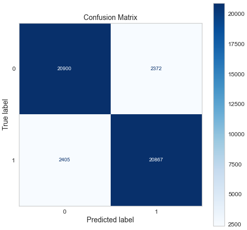
Confusion matrix of gradient boosting classifier.
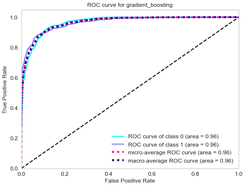
ROC curve of gradient boosting classifier.
Top 3 models (with default parameters)
| Model | Recall score |
|---|---|
| Support vector machine | 88% |
| Gradient boosting | 90% |
| Adaboost | 79% |
- The final model used for this project: Gradient boosting
- Metrics used: Recall
-
Why choose recall as metrics: Since the objective of this problem is to minimize the risk of a credit default, the metrics to use depends on the current economic situation:
-
During a bull market (when the economy is expanding), people feel wealthy and are employed. Money is usually cheap, and the risk of default is low because of economic stability and low unemployment. The financial institution can handle the risk of default; therefore, it is not very strict about giving credit. The financial institution can handle some bad clients as long as most credit card owners are good clients (aka those who pay back their credit in time and in total).In this case, having a good recall (sensitivity) is ideal.
-
During a bear market (when the economy is contracting), people lose their jobs and money through the stock market and other investment venues. Many people struggle to meet their financial obligations. The financial institution, therefore, tends to be more conservative in giving out credit or loans. The financial institution can’t afford to give out credit to many clients who won’t be able to pay back their credit. The financial institution would rather have a smaller number of good clients, even if it means that some good clients are denied credit. In this case, having a good precision (specificity) is desirable.
Note: There is always a trade-off between precision and recall. Choosing the right metrics depends on the problem you are solving.
Conclusion: Since the time I worked on this project (beginning 2022), we were in the longest bull market (excluding March 2020 flash crash) ever recorded; we will use recall as our metric.
-
Lessons learned and recommendation
- Based on this project’s analysis, income, family member headcount, and employment length are the three most predictive features in determining whether an applicant will be approved for a credit card. Other features like age and working employment status are also helpful. The least useful features are the type of dwelling and car ownership.
- The recommendation would be to focus more on the most predictive features when looking at the applicant profile and pay less attention to the least predictive features.
For the rest of my nerdy friends, let’s get started from scratch
Pre-requisites
Wait! no, so fast! Before we start writing code, we need to have our python/jupyter environment ready, and Ken Jee has a fantastic video on this; click here to watch it.
Import necessary libraries
Now we can import all the required libraries. Feel free to visit my other post, where I talk about installing these libraries in the jupyter environment.
import numpy as np
import pandas as pd
import missingno as msno
import matplotlib
import matplotlib.pyplot as plt
import seaborn as sns
import warnings
from pandas.core.common import SettingWithCopyWarning
from pathlib import Path
from scipy.stats import probplot, chi2_contingency, chi2, stats
from sklearn.model_selection import train_test_split, GridSearchCV, RandomizedSearchCV, cross_val_score, cross_val_predict
from sklearn.base import BaseEstimator, TransformerMixin
from sklearn.pipeline import Pipeline
from sklearn.calibration import CalibratedClassifierCV
from sklearn.compose import ColumnTransformer
from sklearn.preprocessing import OneHotEncoder, MinMaxScaler, OrdinalEncoder
from sklearn.metrics import ConfusionMatrixDisplay, classification_report, roc_curve, roc_auc_score
from imblearn.over_sampling import SMOTE
from sklearn.linear_model import SGDClassifier, LogisticRegression
from sklearn.svm import SVC
from sklearn.tree import DecisionTreeClassifier
from sklearn.ensemble import RandomForestClassifier, GradientBoostingClassifier, BaggingClassifier, AdaBoostClassifier, ExtraTreesClassifier
from sklearn.naive_bayes import GaussianNB
from sklearn.neighbors import KNeighborsClassifier
from sklearn.discriminant_analysis import LinearDiscriminantAnalysis
from sklearn.neural_network import MLPClassifier
from sklearn.inspection import permutation_importance
import scikitplot as skplt
from yellowbrick.model_selection import FeatureImportances
import joblib
import os
%matplotlib inline
I will briefly explain what each library does and why we need it for this project.
- NumPy is a library for manipulating multidimensional arrays and matrices. In this project, we will use NumPy to change the sequences of the elements in a list and also transform an array with negative values into absolute ones.
- Pandas is a library to manipulate tabular data stored as dataframes (More than two columns) and Series(when dealing with one column); we will use it in this project to import the data into our notebook, create dataframes, merge and concatenate dataframes.
- MissingNo is a great library to visualize at a glance missing value in a Pandas dataframe.
- Scipy is a library that contains mathematical modules like statistics, optimization, linear algebra, etc
- Pathlib is a built-in python library with useful path functionalities. Pathlib will use it in the project to check if a file exists at a specific path, then use the joblib to save it.
- Matplotlib is a data visualization library to plot different types of plots like histograms, line plots, scatter plots, contour plots, etc. It is built on top of NumPy.
- Seaborn is another data visualization library built on top of Matplotlib with added features and simpler syntax than Matplotlib. We will mainly use this library for our exploratory data analysis.
- Warnings is a python builtin library to control the warnings at the execution time
- Scikit-learn, also called sklearn, is the industry standard machine learning library from which all the machine learning algorithms are imported. It is built on NumPy, Scipy, and Matplotlib.
- Imbalance learn is a library based on sklearn, which provides tools when dealing with classification with imbalanced classes. Here classes mean the prediction results, which in this case, are approved or denied for a credit card. In this project, we have two outcomes (we have a binary classification), and one of the outcomes is less likely to happen, which is reflected in the data. So we use the SMOTE technique to balance the outcomes because we don’t want to train on unbalanced data as we try to avoid bias.
- Scikit-plot is a helpful library that plots scikit-learn objects; for this project, Scikit-plot will use to plot the ROC curve.
- Yellowbrick extends the scikit-learn API library to make a model selection. In this project, we have used it to plot the feature importance.
- Joblib is a builtin python library to save models as files; those models will deploy on AWS S3
- os is a builtin library to access some of the operating system functionality
- Finally, magic command
%matplotlib inlinewill make your plot outputs appear and be stored within the notebook.
Import the data
After importing the libraries, we will now import the datasets. The datasets are from Kaggle. Here is the link.
There are two ways to import the CSV, we can download the file and pass the local machine path to the read_csv pandas function, or we can host the data on GitHub and directly read the hosted CSV file as a raw data. In this case, we went with the latter method.
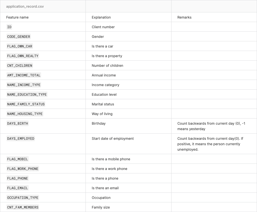
The first dataset is the application record with all the information about the applicants like gender, age, income, etc. The second dataset is the credit record which holds information about the credit status and balance. we will store those two dataset in cc_data_full_data and credit_status respectively.
cc_data_full_data = pd.read_csv('https://raw.githubusercontent.com/semasuka/Credit-card-approval-prediction-classification/main/datasets/application_record.csv')
credit_status = pd.read_csv('https://raw.githubusercontent.com/semasuka/Credit-card-approval-prediction-classification/main/datasets/credit_record.csv')
Let’s glance at the first five rows using each Pandas’ head` method.
cc_data_full_data.head()
| ID | CODE_GENDER | FLAG_OWN_CAR | FLAG_OWN_REALTY | CNT_CHILDREN | AMT_INCOME_TOTAL | NAME_INCOME_TYPE | NAME_EDUCATION_TYPE | NAME_FAMILY_STATUS | NAME_HOUSING_TYPE | DAYS_BIRTH | DAYS_EMPLOYED | FLAG_MOBIL | FLAG_WORK_PHONE | FLAG_PHONE | FLAG_EMAIL | OCCUPATION_TYPE | CNT_FAM_MEMBERS | |
|---|---|---|---|---|---|---|---|---|---|---|---|---|---|---|---|---|---|---|
| 0 | 5008804 | M | Y | Y | 0 | 427500.0 | Working | Higher education | Civil marriage | Rented apartment | -12005 | -4542 | 1 | 1 | 0 | 0 | NaN | 2.0 |
| 1 | 5008805 | M | Y | Y | 0 | 427500.0 | Working | Higher education | Civil marriage | Rented apartment | -12005 | -4542 | 1 | 1 | 0 | 0 | NaN | 2.0 |
| 2 | 5008806 | M | Y | Y | 0 | 112500.0 | Working | Secondary / secondary special | Married | House / apartment | -21474 | -1134 | 1 | 0 | 0 | 0 | Security staff | 2.0 |
| 3 | 5008808 | F | N | Y | 0 | 270000.0 | Commercial associate | Secondary / secondary special | Single / not married | House / apartment | -19110 | -3051 | 1 | 0 | 1 | 1 | Sales staff | 1.0 |
| 4 | 5008809 | F | N | Y | 0 | 270000.0 | Commercial associate | Secondary / secondary special | Single / not married | House / apartment | -19110 | -3051 | 1 | 0 | 1 | 1 | Sales staff | 1.0 |
credit_status.head()
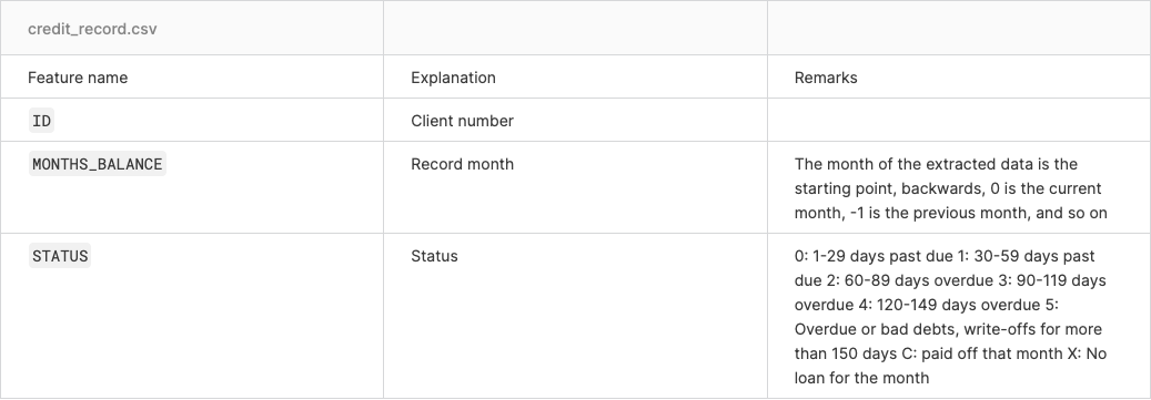
| ID | MONTHS_BALANCE | STATUS | |
|---|---|---|---|
| 0 | 5001711 | 0 | X |
| 1 | 5001711 | -1 | 0 |
| 2 | 5001711 | -2 | 0 |
| 3 | 5001711 | -3 | 0 |
| 4 | 5001712 | 0 | C |
Now let’s look at the metadata of the datasets to understand the data better.
For the application record dataset.
And for the credit record dataset.
Creating a target variable
As you may have noticed from our first dataset, we don’t have a target variable that states whether the client is good or not (a client who will not default on their credit card would be called a good client). We will use the credit record to come up with the target variable. We use the vintage analysis for this.
For simplicity purposes, we will say that the applicants over 60 days overdue are considered bad clients. When the target variable is 1, that means a bad client, and when it is 0, that represents a good client. That is what the following script does.
begin_month=pd.DataFrame(credit_status.groupby(['ID'])['MONTHS_BALANCE'].agg(min))
begin_month=begin_month.rename(columns={'MONTHS_BALANCE':'Account age'})
cc_data_full_data=pd.merge(cc_data_full_data,begin_month,how='left',on='ID')
credit_status['dep_value'] = None
credit_status['dep_value'][credit_status['STATUS'] =='2']='Yes'
credit_status['dep_value'][credit_status['STATUS'] =='3']='Yes'
credit_status['dep_value'][credit_status['STATUS'] =='4']='Yes'
credit_status['dep_value'][credit_status['STATUS'] =='5']='Yes'
cpunt=credit_status.groupby('ID').count()
cpunt['dep_value'][cpunt['dep_value'] > 0]='Yes'
cpunt['dep_value'][cpunt['dep_value'] == 0]='No'
cpunt = cpunt[['dep_value']]
cc_data_full_data = pd.merge(cc_data_full_data,cpunt,how='inner',on='ID')
cc_data_full_data['Is high risk']=cc_data_full_data['dep_value']
cc_data_full_data.loc[cc_data_full_data['Is high risk']=='Yes','Is high risk']=1
cc_data_full_data.loc[cc_data_full_data['Is high risk']=='No','Is high risk']=0
cc_data_full_data.drop('dep_value',axis=1,inplace=True)
pd.options.mode.chained_assignment = None # hide warning SettingWithCopyWarning
/var/folders/bb/dzx22n7n1t1gkqfhhky4j2ch0000gn/T/ipykernel_29855/1467211908.py:5: SettingWithCopyWarning:
A value is trying to be set on a copy of a slice from a DataFrame

See the caveats in the documentation: https://pandas.pydata.org/pandas-docs/stable/user_guide/indexing.html#returning-a-view-versus-a-copy
  credit_status['dep_value'][credit_status['STATUS'] =='2']='Yes'
/var/folders/bb/dzx22n7n1t1gkqfhhky4j2ch0000gn/T/ipykernel_29855/1467211908.py:6: SettingWithCopyWarning:
A value is trying to be set on a copy of a slice from a DataFrame

See the caveats in the documentation: https://pandas.pydata.org/pandas-docs/stable/user_guide/indexing.html#returning-a-view-versus-a-copy
  credit_status['dep_value'][credit_status['STATUS'] =='3']='Yes'
/var/folders/bb/dzx22n7n1t1gkqfhhky4j2ch0000gn/T/ipykernel_29855/1467211908.py:7: SettingWithCopyWarning:
A value is trying to be set on a copy of a slice from a DataFrame

See the caveats in the documentation: https://pandas.pydata.org/pandas-docs/stable/user_guide/indexing.html#returning-a-view-versus-a-copy
  credit_status['dep_value'][credit_status['STATUS'] =='4']='Yes'
/var/folders/bb/dzx22n7n1t1gkqfhhky4j2ch0000gn/T/ipykernel_29855/1467211908.py:8: SettingWithCopyWarning:
A value is trying to be set on a copy of a slice from a DataFrame

See the caveats in the documentation: https://pandas.pydata.org/pandas-docs/stable/user_guide/indexing.html#returning-a-view-versus-a-copy
  credit_status['dep_value'][credit_status['STATUS'] =='5']='Yes'
Let’s print the first 5 rows of the dataframe, with the newly created target column Is high risk at the end.
cc_data_full_data.head()
| ID | CODE_GENDER | FLAG_OWN_CAR | FLAG_OWN_REALTY | CNT_CHILDREN | AMT_INCOME_TOTAL | NAME_INCOME_TYPE | NAME_EDUCATION_TYPE | NAME_FAMILY_STATUS | NAME_HOUSING_TYPE | DAYS_BIRTH | DAYS_EMPLOYED | FLAG_MOBIL | FLAG_WORK_PHONE | FLAG_PHONE | FLAG_EMAIL | OCCUPATION_TYPE | CNT_FAM_MEMBERS | Account age | Is high risk | |
|---|---|---|---|---|---|---|---|---|---|---|---|---|---|---|---|---|---|---|---|---|
| 0 | 5008804 | M | Y | Y | 0 | 427500.0 | Working | Higher education | Civil marriage | Rented apartment | -12005 | -4542 | 1 | 1 | 0 | 0 | NaN | 2.0 | -15.0 | 0 |
| 1 | 5008805 | M | Y | Y | 0 | 427500.0 | Working | Higher education | Civil marriage | Rented apartment | -12005 | -4542 | 1 | 1 | 0 | 0 | NaN | 2.0 | -14.0 | 0 |
| 2 | 5008806 | M | Y | Y | 0 | 112500.0 | Working | Secondary / secondary special | Married | House / apartment | -21474 | -1134 | 1 | 0 | 0 | 0 | Security staff | 2.0 | -29.0 | 0 |
| 3 | 5008808 | F | N | Y | 0 | 270000.0 | Commercial associate | Secondary / secondary special | Single / not married | House / apartment | -19110 | -3051 | 1 | 0 | 1 | 1 | Sales staff | 1.0 | -4.0 | 0 |
| 4 | 5008809 | F | N | Y | 0 | 270000.0 | Commercial associate | Secondary / secondary special | Single / not married | House / apartment | -19110 | -3051 | 1 | 0 | 1 | 1 | Sales staff | 1.0 | -26.0 | 0 |
Since the features (columns) names are not very descriptive, we will change them to make them more readable.
# rename the features to more readable feature names
cc_data_full_data = cc_data_full_data.rename(columns={
    'CODE_GENDER':'Gender',
    'FLAG_OWN_CAR':'Has a car',
    'FLAG_OWN_REALTY':'Has a property',
    'CNT_CHILDREN':'Children count',
    'AMT_INCOME_TOTAL':'Income',
    'NAME_INCOME_TYPE':'Employment status',
    'NAME_EDUCATION_TYPE':'Education level',
    'NAME_FAMILY_STATUS':'Marital status',
    'NAME_HOUSING_TYPE':'Dwelling',
    'DAYS_BIRTH':'Age',
    'DAYS_EMPLOYED': 'Employment length',
    'FLAG_MOBIL': 'Has a mobile phone',
    'FLAG_WORK_PHONE': 'Has a work phone',
    'FLAG_PHONE': 'Has a phone',
    'FLAG_EMAIL': 'Has an email',
    'OCCUPATION_TYPE': 'Job title',
    'CNT_FAM_MEMBERS': 'Family member count',
    'Account age': 'Account age'
    })
Now we will split the cc_data_full_data into a training and testing set. We will use 80% of the data for training and 20% for testing and store them respectively in cc_train_original and cc_test_original variables.
# split the data into train and test dataset
def data_split(df, test_size):
    train_df, test_df = train_test_split(df, test_size=test_size, random_state=42)
    # reset the indexes
    return train_df.reset_index(drop=True), test_df.reset_index(drop=True)
# we set the test_size to 0.2, which means that the train_size will be 0.8
cc_train_original, cc_test_original = data_split(cc_data_full_data, 0.2)
Dataframe’s shape function helps us know the dimension of the dataframe. Here we have 20 features(columns) and 29165 observations(rows) for the training dataset.
cc_train_original.shape
(29165, 20)
And 20 features(columns) and 7292 observations(rows) for the testing dataset.
cc_test_original.shape
(7292, 20)
Finally, we will export the data as a CSV file on our local machine and create a copy of the dataset. Please note that these steps are optional. It is best practice to keep the original dataset untouched as a backup and work with the copy.
cc_train_original.to_csv('dataset/train.csv',index=False)
cc_test_original.to_csv('dataset/test.csv',index=False)
# creating a copy of the dataset so that the original stays untouched
cc_train_copy = cc_train_original.copy()
cc_test_copy = cc_test_original.copy()
Data at a glance
Now that we have split the dataset into training and testing datasets, we will focus on the training dataset for now and use the test dataset toward the end of this post.
Let’s review the first 5 rows again with the head() function.
cc_data_full_data.head()
| ID | Gender | Has a car | Has a property | Children count | Income | Employment status | Education level | Marital status | Dwelling | Age | Employment length | Has a mobile phone | Has a work phone | Has a phone | Has an email | Job title | Family member count | Account age | Is high risk | |
|---|---|---|---|---|---|---|---|---|---|---|---|---|---|---|---|---|---|---|---|---|
| 0 | 5008804 | M | Y | Y | 0 | 427500.0 | Working | Higher education | Civil marriage | Rented apartment | -12005 | -4542 | 1 | 1 | 0 | 0 | NaN | 2.0 | -15.0 | 0 |
| 1 | 5008805 | M | Y | Y | 0 | 427500.0 | Working | Higher education | Civil marriage | Rented apartment | -12005 | -4542 | 1 | 1 | 0 | 0 | NaN | 2.0 | -14.0 | 0 |
| 2 | 5008806 | M | Y | Y | 0 | 112500.0 | Working | Secondary / secondary special | Married | House / apartment | -21474 | -1134 | 1 | 0 | 0 | 0 | Security staff | 2.0 | -29.0 | 0 |
| 3 | 5008808 | F | N | Y | 0 | 270000.0 | Commercial associate | Secondary / secondary special | Single / not married | House / apartment | -19110 | -3051 | 1 | 0 | 1 | 1 | Sales staff | 1.0 | -4.0 | 0 |
| 4 | 5008809 | F | N | Y | 0 | 270000.0 | Commercial associate | Secondary / secondary special | Single / not married | House / apartment | -19110 | -3051 | 1 | 0 | 1 | 1 | Sales staff | 1.0 | -26.0 | 0 |
Now let’s see the data types of each of the features with the info() function.
cc_data_full_data.info()
<class 'pandas.core.frame.DataFrame'>
Int64Index: 36457 entries, 0 to 36456
Data columns (total 20 columns):
 #   Column               Non-Null Count  Dtype
---  ------               --------------  -----
 0   ID                   36457 non-null  int64
 1   Gender               36457 non-null  object
 2   Has a car            36457 non-null  object
 3   Has a property       36457 non-null  object
 4   Children count       36457 non-null  int64
 5   Income               36457 non-null  float64
 6   Employment status    36457 non-null  object
 7   Education level      36457 non-null  object
 8   Marital status       36457 non-null  object
 9   Dwelling             36457 non-null  object
 10  Age                  36457 non-null  int64
 11  Employment length    36457 non-null  int64
 12  Has a mobile phone   36457 non-null  int64
 13  Has a work phone     36457 non-null  int64
 14  Has a phone          36457 non-null  int64
 15  Has an email         36457 non-null  int64
 16  Job title            25134 non-null  object
 17  Family member count  36457 non-null  float64
 18  Account age          36457 non-null  float64
 19  Is high risk         36457 non-null  object
dtypes: float64(3), int64(8), object(9)
memory usage: 5.8+ MB
Let’s digest the information above. The first column is the indexes of the features; the second is the names; the third is the count of non-null values(only the job title has missing values); and the fourth is datatypes (objects which mean strings datatype, float or integer).
The describe() function gives us statistics about the numerical features in the dataset. These statistics include each numerical feature’s count, mean, standard deviation, interquartile range(25%, 50%, 75%), and minimum and maximum values.
cc_data_full_data.describe()
| ID | Children count | Income | Age | Employment length | Has a mobile phone | Has a work phone | Has a phone | Has an email | Family member count | Account age | |
|---|---|---|---|---|---|---|---|---|---|---|---|
| count | 3.645700e+04 | 36457.000000 | 3.645700e+04 | 36457.000000 | 36457.000000 | 36457.0 | 36457.000000 | 36457.000000 | 36457.000000 | 36457.000000 | 36457.000000 |
| mean | 5.078227e+06 | 0.430315 | 1.866857e+05 | -15975.173382 | 59262.935568 | 1.0 | 0.225526 | 0.294813 | 0.089722 | 2.198453 | -26.164193 |
| std | 4.187524e+04 | 0.742367 | 1.017892e+05 | 4200.549944 | 137651.334859 | 0.0 | 0.417934 | 0.455965 | 0.285787 | 0.911686 | 16.501854 |
| min | 5.008804e+06 | 0.000000 | 2.700000e+04 | -25152.000000 | -15713.000000 | 1.0 | 0.000000 | 0.000000 | 0.000000 | 1.000000 | -60.000000 |
| 25% | 5.042028e+06 | 0.000000 | 1.215000e+05 | -19438.000000 | -3153.000000 | 1.0 | 0.000000 | 0.000000 | 0.000000 | 2.000000 | -39.000000 |
| 50% | 5.074614e+06 | 0.000000 | 1.575000e+05 | -15563.000000 | -1552.000000 | 1.0 | 0.000000 | 0.000000 | 0.000000 | 2.000000 | -24.000000 |
| 75% | 5.115396e+06 | 1.000000 | 2.250000e+05 | -12462.000000 | -408.000000 | 1.0 | 0.000000 | 1.000000 | 0.000000 | 3.000000 | -12.000000 |
| max | 5.150487e+06 | 19.000000 | 1.575000e+06 | -7489.000000 | 365243.000000 | 1.0 | 1.000000 | 1.000000 | 1.000000 | 20.000000 | 0.000000 |
We will use the Missingno to visualize the missing values per feature using its matrix function.
msno.matrix(cc_data_full_data)
plt.show()
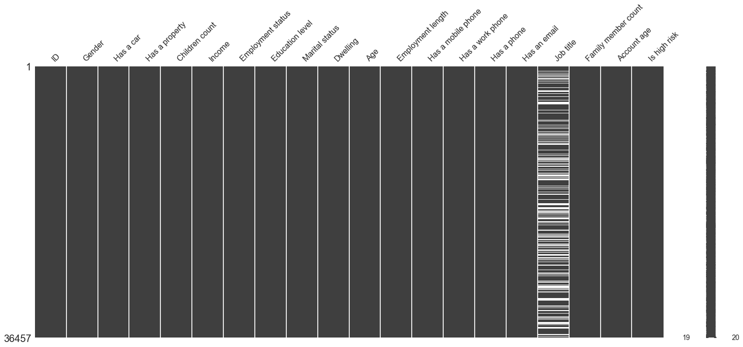
Here we can see that the Job title is the only feature with missing values. Slim white lines represent missing values.
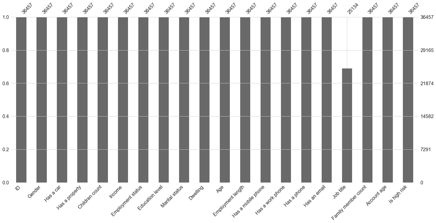
To see a clear representation of the missing values count, we can use its bar() function to have a barplot with the count of non-null values.
msno.bar(cc_data_full_data)
plt.show()
Now we will create functions to analyze each feature(Univariate analysis). Don’t worry too much about understanding these functions, as we will see how they are used during the exploratory data analysis section.
Our first function value_cnt_norm_cal is used to calculate the count of each class in a feature with its frequency (normalized on a scale of 100)
def value_cnt_norm_cal(df,feature):
    '''Function that will return the value count and frequency of each observation within a feature'''
    # get the value counts of each feature
    ftr_value_cnt = df[feature].value_counts()
    # normalize the value counts on a scale of 100
    ftr_value_cnt_norm = df[feature].value_counts(normalize=True) * 100
    # concatenate the value counts with normalized value count column wise
    ftr_value_cnt_concat = pd.concat([ftr_value_cnt, ftr_value_cnt_norm], axis=1)
    # give it a column name
    ftr_value_cnt_concat.columns = ['Count', 'Frequency (%)']
    # return the dataframe
    return ftr_value_cnt_concat
gen_info_feat returned the description, the datatype, statistics, the value counts and frequencies
Note: I have used the if statement to handle features differently depending on their data type and characteristics. For example, I divided age by 365.25 and changed it to a positive value because it is expressed in days instead of years. Same as employment length; however, we did not print the value count for account age.
def gen_info_feat(df,feature):
    '''function to display general information about the feature'''
    # if the feature is Age
    if feature == 'Age':
        # change the feature to be expressed in positive numbers of days and divide by 365.25 to be expressed in years and get the description
        print('Description:\n{}'.format((np.abs(df[feature])/365.25).describe()))
        # print separators
        print('*'*50)
        # print the datatype
        print('Object type:{}'.format(df[feature].dtype))
    # if the feature is employment length
    if feature == 'Employment length':
        # select only the rows where the rows are negative values to ignore those who have retired or are unemployed
        employment_len_no_ret = cc_train_copy['Employment length'][cc_train_copy['Employment length'] < 0]
        # change the negative values to positive values
        employment_len_no_ret_yrs = np.abs(employment_len_no_ret)/365.25
        # print the descriptions
        print('Description:\n{}'.format((employment_len_no_ret_yrs).describe()))
        # print separators
        print('*'*50)
        # print the datatype
        print('Object type:{}'.format(employment_len_no_ret.dtype))
    # if the feature is account age
    if feature == 'Account age' or feature == 'Income':
        # change the account age to a positive number of months and get the description
        print('Description:\n{}'.format((np.abs(df[feature])).describe()))
        # print separators
        print('*'*50)
        # print the datatype
        print('Object type:{}'.format(df[feature].dtype))
    # if it is any other feature
    else:
        # get the description
        print('Description:\n{}'.format(df[feature].describe()))
        # print separators
        print('*'*50)
        # print the datatype
        print('Object type:\n{}'.format(df[feature].dtype))
        # print separators
        print('*'*50)
        # calling the value_cnt_norm_cal function previously seen
        value_cnt = value_cnt_norm_cal(df,feature)
        # print the result
        print('Value count:\n{}'.format(value_cnt))
The following function prints a pie chart.
def create_pie_plot(df,feature):
    '''function to create a pie chart plot'''
    # if the feature is dwelling or education level
    if feature == 'Dwelling' or feature == 'Education level':
        # calling the value_cnt_norm_cal function previously seen
        ratio_size = value_cnt_norm_cal(df, feature)
        # get how many classes we have
        ratio_size_len = len(ratio_size.index)
        ratio_list = []
        # loop till the max range
        for i in range(ratio_size_len):
            #append the ratio of each feature to the list
            ratio_list.append(ratio_size.iloc[i]['Frequency (%)'])
        # create a subplot
        fig, ax = plt.subplots(figsize=(8,8))
        # %1.2f%% display decimals in the pie chart with 2 decimal places
        plt.pie(ratio_list, startangle=90, wedgeprops={'edgecolor' :'black'})
        # add a title to the chart
        plt.title('Pie chart of {}'.format(feature))
        # add a legend to the chart
        plt.legend(loc='best',labels=ratio_size.index)
        # center the plot in the subplot
        plt.axis('equal')

        # return the plot
        return plt.show()
    # for other features
    else:
        ratio_size = value_cnt_norm_cal(df, feature)
        ratio_size_len = len(ratio_size.index)
        ratio_list = []
        for i in range(ratio_size_len):
            ratio_list.append(ratio_size.iloc[i]['Frequency (%)'])
        fig, ax = plt.subplots(figsize=(8,8))
        # %1.2f%% display decimals in the pie chart with 2 decimal places
        plt.pie(ratio_list, labels=ratio_size.index, autopct='%1.2f%%', startangle=90, wedgeprops={'edgecolor' :'black'})
        plt.title('Pie chart of {}'.format(feature))
        plt.legend(loc='best')
        plt.axis('equal')
        return plt.show()
The next function create a bar plot.
def create_bar_plot(df,feature):
    '''function to create a bar chart plot'''
    if feature == 'Marital status' or feature == 'Dwelling' or feature == 'Job title' or feature == 'Employment status' or feature == 'Education level':
        fig, ax = plt.subplots(figsize=(6,10))
        # create a barplot using seaborn with X-axis the indexes from value_cnt_norm_cal function and Y axis we use the value counts from the same function
        sns.barplot(x=value_cnt_norm_cal(df,feature).index,y=value_cnt_norm_cal(df,feature).values[:,0])
        # set the plot's tick labels to the index from the value_cnt_norm_cal function, rotate those ticks by 45 degrees
        ax.set_xticklabels(labels=value_cnt_norm_cal(df,feature).index,rotation=45,ha='right')
        # Give the X-axis the same label as the feature name
        plt.xlabel('{}'.format(feature))
        # Give the Y-axis the label "Count"
        plt.ylabel('Count')
        # Give the plot a title
        plt.title('{} count'.format(feature))
        # Return the title
        return plt.show()
    else:
        fig, ax = plt.subplots(figsize=(6,10))
        sns.barplot(x=value_cnt_norm_cal(df,feature).index,y=value_cnt_norm_cal(df,feature).values[:,0])
        plt.xlabel('{}'.format(feature))
        plt.ylabel('Count')
        plt.title('{} count'.format(feature))
        return plt.show()
This function will create a box plot for continuous variables.
Note: Depending on which transformation needs to be done on each feature, we have used a switch statement to handle the different feature that requires different handling.
def create_box_plot(df,feature):
    '''function to create a box plot'''
    if feature == 'Age':
        fig, ax = plt.subplots(figsize=(2,8))
        # change the feature to be expressed in positive numbers days
        sns.boxplot(y=np.abs(df[feature])/365.25)
        plt.title('{} distribution(Boxplot)'.format(feature))
        return plt.show()
    if feature == 'Children count':
        fig, ax = plt.subplots(figsize=(2,8))
        sns.boxplot(y=df[feature])
        plt.title('{} distribution(Boxplot)'.format(feature))
        # use the numpy arrange to populate the Y ticks starting from 0 till the max count of children with an interval of 1 as follows np.arange(start, stop, step)
        plt.yticks(np.arange(0,df[feature].max(),1))
        return plt.show()
    if feature == 'Employment length':
        fig, ax = plt.subplots(figsize=(2,8))
        employment_len_no_ret = cc_train_copy['Employment length'][cc_train_copy['Employment length'] < 0]
        # employment length in days is a negative number, so we need to change it to positive and change it to years
        employment_len_no_ret_yrs = np.abs(employment_len_no_ret)/365.25
        # create a boxplot with seaborn
        sns.boxplot(y=employment_len_no_ret_yrs)
        plt.title('{} distribution(Boxplot)'.format(feature))
        plt.yticks(np.arange(0,employment_len_no_ret_yrs.max(),2))
        return plt.show()
    if feature == 'Income':
        fig, ax = plt.subplots(figsize=(2,8))
        sns.boxplot(y=df[feature])
        plt.title('{} distribution(Boxplot)'.format(feature))
        # suppress the scientific notation
        ax.get_yaxis().set_major_formatter(
            matplotlib.ticker.FuncFormatter(lambda x, p: format(int(x), ',')))
        return plt.show()
    if feature == 'Account age':
        fig, ax = plt.subplots(figsize=(2,8))
        sns.boxplot(y=np.abs(df[feature]))
        plt.title('{} distribution(Boxplot)'.format(feature))
        return plt.show()
    else:
        fig, ax = plt.subplots(figsize=(2,8))
        sns.boxplot(y=df[feature])
        plt.title('{} distribution(Boxplot)'.format(feature))
        return plt.show()
This function will plot a histogram.
def create_hist_plot(df,feature, the_bins=50):
    '''function to create a histogram plot'''
    if feature == 'Age':
        fig, ax = plt.subplots(figsize=(18,10))
        # change the feature to be expressed in positive numbers days
        sns.histplot(np.abs(df[feature])/365.25,bins=the_bins,kde=True)
        plt.title('{} distribution'.format(feature))
        return plt.show()
    if feature == 'Income':
        fig, ax = plt.subplots(figsize=(18,10))
        sns.histplot(df[feature],bins=the_bins,kde=True)
        # suppress scientific notation
        ax.get_xaxis().set_major_formatter(
            matplotlib.ticker.FuncFormatter(lambda x, p: format(int(x), ',')))
        plt.title('{} distribution'.format(feature))
        return plt.show()
    if feature == 'Employment length':
        employment_len_no_ret = cc_train_copy['Employment length'][cc_train_copy['Employment length'] < 0]
        # change the feature to be expressed in positive numbers days
        employment_len_no_ret_yrs = np.abs(employment_len_no_ret)/365.25
        fig, ax = plt.subplots(figsize=(18,10))
        sns.histplot(employment_len_no_ret_yrs,bins=the_bins,kde=True)
        plt.title('{} distribution'.format(feature))
        return plt.show()
    if feature == 'Account age':
        fig, ax = plt.subplots(figsize=(18,10))
        sns.histplot(np.abs(df[feature]),bins=the_bins,kde=True)
        plt.title('{} distribution'.format(feature))
        return plt.show()
    else:
        fig, ax = plt.subplots(figsize=(18,10))
        sns.histplot(df[feature],bins=the_bins,kde=True)
        plt.title('{} distribution'.format(feature))
        return plt.show()
This function will plot two box plots, one is for low-risk (good client), and the other is for high-risk (bad client) applicants. On the Y axis, we have the continuous features we are studying. Again don’t worry too much, as we will see these functions in action in the sections below.
def low_high_risk_box_plot(df,feature):
    '''High risk vs low risk applicants compared on a box plot'''
    if feature == 'Age':
        print(np.abs(df.groupby('Is high risk')[feature].mean()/365.25))
        fig, ax = plt.subplots(figsize=(5,8))
        # Place on the Y-axis age and X-axis the two box plot (is high risk: No and Yes)
        sns.boxplot(y=np.abs(df[feature])/365.25,x=df['Is high risk'])
        # add ticks to the X axis
        plt.xticks(ticks=[0,1],labels=['no','yes'])
        plt.title('High risk individuals grouped by age')
        return plt.show()
    if feature == 'Income':
        print(np.abs(df.groupby('Is high risk')[feature].mean()))
        fig, ax = plt.subplots(figsize=(5,8))
        sns.boxplot(y=np.abs(df[feature]),x=df['Is high risk'])
        plt.xticks(ticks=[0,1],labels=['no','yes'])
        # suppress the scientific notation
        ax.get_yaxis().set_major_formatter(
            matplotlib.ticker.FuncFormatter(lambda x, p: format(int(x), ',')))
        plt.title('High risk individuals grouped by {}'.format(feature))
        return plt.show()
    if feature == 'Employment length':
        # checking is an applicant is high risk or not (for those who have negative employment length mean only those who are employed)
        employment_no_ret = cc_train_copy['Employment length'][cc_train_copy['Employment length'] <0]
        employment_no_ret_idx = employment_no_ret.index
        employment_len_no_ret_yrs = np.abs(employment_no_ret)/365.25
        # extract those who are employed from the original dataframe and return only the employment length and Is high risk columns
        employment_no_ret_df = cc_train_copy.iloc[employment_no_ret_idx][['Employment length','Is high risk']]
        # return the mean employment length group by how risky is the applicant
        employment_no_ret_is_high_risk = employment_no_ret_df.groupby('Is high risk')['Employment length'].mean()
        print(np.abs(employment_no_ret_is_high_risk)/365.25)
        fig, ax = plt.subplots(figsize=(5,8))
        sns.boxplot(y=employment_len_no_ret_yrs,x=df['Is high risk'])
        plt.xticks(ticks=[0,1],labels=['no','yes'])
        plt.title('High vs low risk individuals grouped by {}'.format(feature))
        return plt.show()
    else:
        print(np.abs(df.groupby('Is high risk')[feature].mean()))
        fig, ax = plt.subplots(figsize=(5,8))
        sns.boxplot(y=np.abs(df[feature]),x=df['Is high risk'])
        plt.xticks(ticks=[0,1],labels=['no','yes'])
        plt.title('High risk individuals grouped by {}'.format(feature))
        return plt.show()
This function is similar to the previous one; the only difference is that it uses a bar plot which is a count of classes for comparison purposes between high risk and low risk.
def low_high_risk_bar_plot(df,feature):
    '''High risk vs low risk applicants compared on a bar plot'''
    # get the sum of high-risk clients grouped by a specific feature
    is_high_risk_grp = df.groupby(feature)['Is high risk'].sum()
    # sort is a descending order
    is_high_risk_grp_srt = is_high_risk_grp.sort_values(ascending=False)
    print(dict(is_high_risk_grp_srt))
    fig, ax = plt.subplots(figsize=(6,10))
    # plot on the X axis the indexes which correspond to classes, and on the Y axis, the count
    sns.barplot(x=is_high_risk_grp_srt.index,y=is_high_risk_grp_srt.values)
    # add the labels to the plot
    ax.set_xticklabels(labels=is_high_risk_grp_srt.index,rotation=45, ha='right')
    plt.ylabel('Count')
    plt.title('High risk applicants count grouped by {}'.format(feature))
    return plt.show()
Now let’s properly start our exploratory data analysis with a univariate analysis. Univariate analysis is an analysis of each feature individually in the dataset.
Univariate analysis
Gender
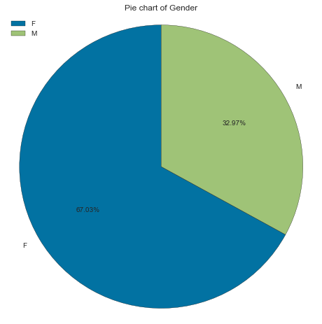
We start with Gender. We call gen_info_feat and see that we have two unique classes F (for female) and M (for male), with 19549 and 9616 occurrences, respectively. Percentage-wise we have 67.02% females and 32.97% males.
gen_info_feat(cc_train_copy,'Gender')
Description:
count     29165
unique        2
top           F
freq      19549
Name: Gender, dtype: object
**************************************************
Object type:
object
**************************************************
Value count:
   Count  Frequency (%)
F  19549      67.028973
M   9616      32.971027
create_bar_plot(cc_train_copy,'Gender')
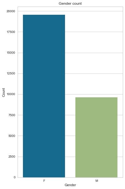
create_pie_plot(cc_train_copy,'Gender')
Age
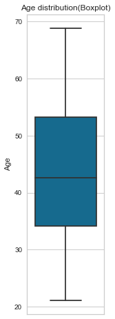
Now let’s look at Age; since age is a continuous variable, we will process it differently than Gender. Using the gen_info_feat function, we look at the mean, standard deviation, minimum, maximum and interquartile range. Then we plot that information on a box plot by calling the create_box_plot function. With that, we can see that the youngest applicant(s) is 21 years old while the oldest is 68. With an average of 43.7 and a median of 42.6 (outliers insensitive)
gen_info_feat(cc_train_copy,'Age')
Description:
count    29165.000000
mean        43.749425
std         11.507180
min         21.095140
25%         34.154689
50%         42.614648
75%         53.234771
max         68.862423
Name: Age, dtype: float64
**************************************************
Object type:int64
Description:
count    29165.000000
mean    -15979.477490
std       4202.997485
min     -25152.000000
25%     -19444.000000
50%     -15565.000000
75%     -12475.000000
max      -7705.000000
Name: Age, dtype: float64
**************************************************
Object type:
int64
**************************************************
Value count:
        Count  Frequency (%)
-12676     44       0.150866
-15519     44       0.150866
-16896     33       0.113149
-16053     26       0.089148
-16768     26       0.089148
...       ...            ...
-18253      1       0.003429
-23429      1       0.003429
-15478      1       0.003429
-21648      1       0.003429
-19564      1       0.003429

[6794 rows x 2 columns]
create_box_plot(cc_train_copy,'Age')
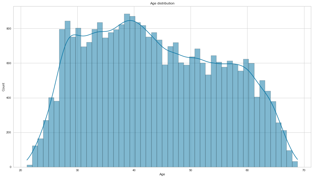
After that, we plot its histogram with the kernel density estimator. ``` Age `` is not normally distributed; it is slightly positively skewed.
create_hist_plot(cc_train_copy,'Age')
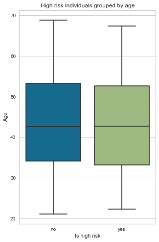
Now we perform a quick bivariate analysis (comparison of two features) of Age and the target variable Is high risk. The blue box plot represents a good client (is high risk = No), and the green box plot represents a bad client (is high risk = Yes). We can see no significant difference between the age of those who are high risk and those who are not. The mean age for both groups is around 43 years old, and there is no correlation between the age and risk factors of the applicant.
low_high_risk_box_plot(cc_train_copy,'Age')
Is high risk
0    43.753103
1    43.538148
Name: Age, dtype: float64
Marital status
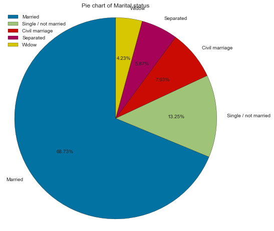
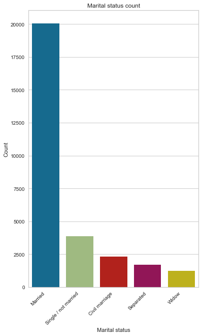
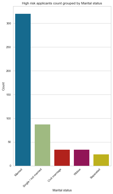
There are 5 unique classes for this feature. Married constitutes the most significant proportion of marital status, with 68% far ahead of single, as seen on the pie chart and bar charts. Another interesting observation is that even though we have a higher number of applicants who are separated than widows, it seems that widow applicants are bad clients than those who are separated by a small margin.
gen_info_feat(cc_train_copy,'Marital status')
Description:
count       29165
unique          5
top       Married
freq        20044
Name: Marital status, dtype: object
**************************************************
Object type:
object
**************************************************
Value count:
                      Count  Frequency (%)
Married               20044      68.726213
Single / not married   3864      13.248757
Civil marriage         2312       7.927310
Separated              1712       5.870050
Widow                  1233       4.227670
create_pie_plot(cc_train_copy,'Marital status')
create_bar_plot(cc_train_copy,'Marital status')
low_high_risk_bar_plot(cc_train_copy,'Marital status')
{'Married': 320, 'Single / not married': 87, 'Civil marriage': 34, 'Widow': 34, 'Separated': 24}
Family member count
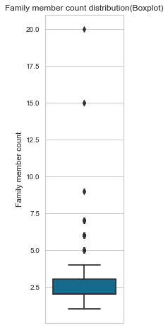
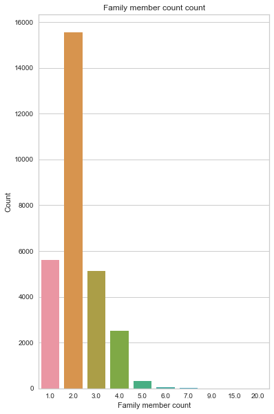
Family member count is a numerical feature, with the median of 2 family members representing 53% (count = 15552) of all the counts, followed by a single family member with 19% (count = 5613). Looking at the box plot, we have 6 outliers; 2 are extreme, with 20 and 15 members in their household.
gen_info_feat(cc_train_copy,'Family member count')
Description:
count    29165.000000
mean         2.197531
std          0.912189
min          1.000000
25%          2.000000
50%          2.000000
75%          3.000000
max         20.000000
Name: Family member count, dtype: float64
**************************************************
Object type:
float64
**************************************************
Value count:
      Count  Frequency (%)
2.0   15552      53.324190
1.0    5613      19.245671
3.0    5121      17.558718
4.0    2503       8.582205
5.0     309       1.059489
6.0      48       0.164581
7.0      14       0.048003
9.0       2       0.006858
15.0      2       0.006858
20.0      1       0.003429
create_box_plot(cc_train_copy,'Family member count')
create_bar_plot(cc_train_copy,'Family member count')
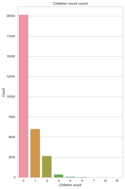
Children count
From the chart below, we can see that most applicants don’t have any children. Again, we have 6 outliers, most probably the same seen from the family member count.
gen_info_feat(cc_train_copy,'Children count')
Description:
count    29165.000000
mean         0.430790
std          0.741882
min          0.000000
25%          0.000000
50%          0.000000
75%          1.000000
max         19.000000
Name: Children count, dtype: float64
**************************************************
Object type:
int64
**************************************************
Value count:
    Count  Frequency (%)
0   20143      69.065661
1    6003      20.582890
2    2624       8.997086
3     323       1.107492
4      52       0.178296
5      15       0.051432
7       2       0.006858
14      2       0.006858
19      1       0.003429
create_box_plot(cc_train_copy,'Children count')
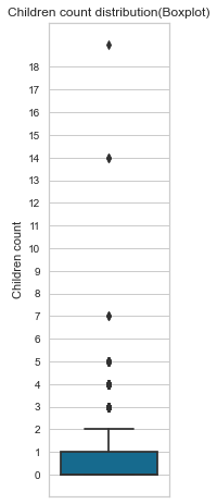
create_bar_plot(cc_train_copy,'Children count')
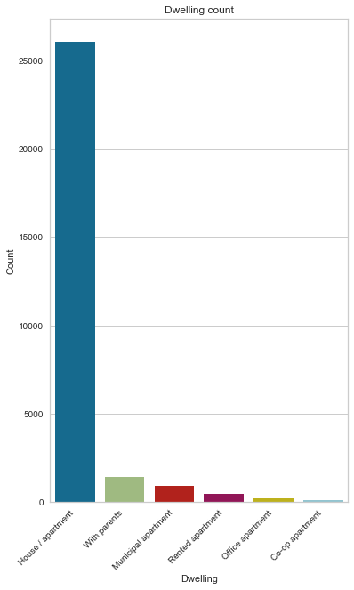
Dwelling type
89% of applicants live in houses/apartments by a substantial margin.
gen_info_feat(cc_train_copy,'Dwelling')
Description:
count                 29165
unique                    6
top       House / apartment
freq                  26059
Name: Dwelling, dtype: object
**************************************************
Object type:
object
**************************************************
Value count:
                     Count  Frequency (%)
House / apartment    26059      89.350249
With parents          1406       4.820847
Municipal apartment    912       3.127036
Rented apartment       453       1.553232
Office apartment       208       0.713184
Co-op apartment        127       0.435453
create_pie_plot(cc_train_copy,'Dwelling')
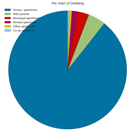
create_bar_plot(cc_train_copy,'Dwelling')
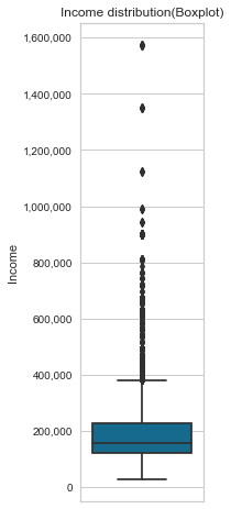
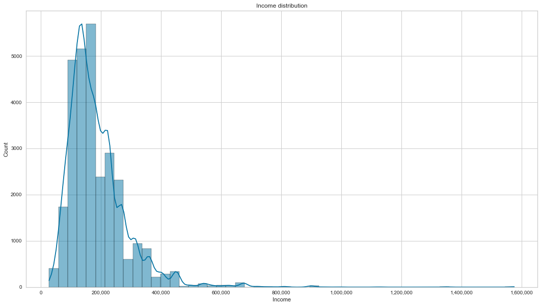
Income
Looking at the results from the gen_info_feat function, we can see that the average mean income is 186890, but this amount factors in outliers. Most people make 157500 (median income) if we ignore the outliers. We have 3 applicants who make more than 1000000.
This feature is also positively skewed. Focusing on the income box plot of good and bad clients, they all have roughly similar incomes.
pd.set_option('display.float_format', lambda x: '%.2f' % x)
gen_info_feat(cc_train_copy,'Income')
Description:
count     29165.00
mean     186890.39
std      101409.64
min       27000.00
25%      121500.00
50%      157500.00
75%      225000.00
max     1575000.00
Name: Income, dtype: float64
**************************************************
Object type:float64
create_box_plot(cc_train_copy,'Income')
create_hist_plot(cc_train_copy,'Income')
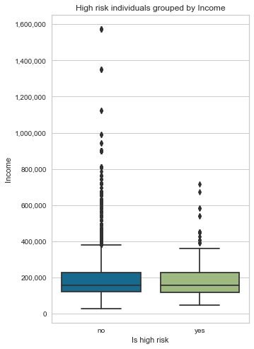
- bivariate analysis with target variable
low_high_risk_box_plot(cc_train_copy,'Income')
Is high risk
0   186913.94
1   185537.26
Name: Income, dtype: float64
Job title
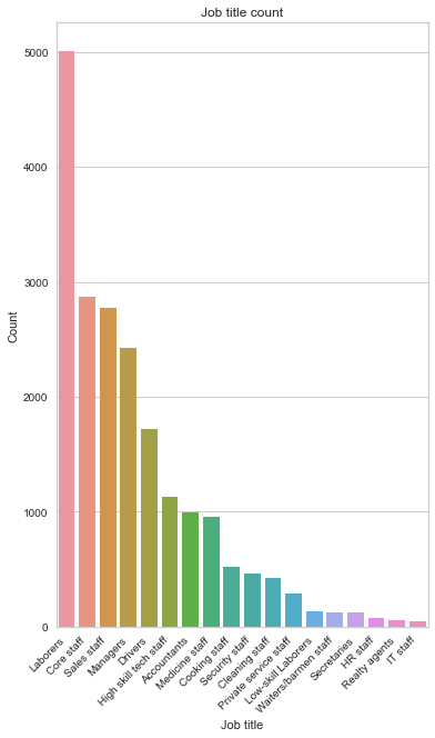
The most common Job title is laborers by a large margin (24.85%), followed by core staff (14.23%), sales staff (13.77%) and managers (12.03%). We also have 30.95% of missing data.
gen_info_feat(cc_train_copy,'Job title')
Description:
count        20138
unique          18
top       Laborers
freq          5004
Name: Job title, dtype: object
**************************************************
Object type:
object
**************************************************
Value count:
                       Count  Frequency (%)
Laborers                5004          24.85
Core staff              2866          14.23
Sales staff             2773          13.77
Managers                2422          12.03
Drivers                 1722           8.55
High skill tech staff   1133           5.63
Accountants              998           4.96
Medicine staff           956           4.75
Cooking staff            521           2.59
Security staff           464           2.30
Cleaning staff           425           2.11
Private service staff    287           1.43
Low-skill Laborers       138           0.69
Waiters/barmen staff     127           0.63
Secretaries              122           0.61
HR staff                  72           0.36
Realty agents             60           0.30
IT staff                  48           0.24
job_title_nan_count = cc_train_copy['Job title'].isna().sum()
job_title_nan_count
9027
rows_total_count = cc_train_copy.shape[0]
print('The percentage of missing rows is {:.2f} %'.format(job_title_nan_count * 100 / rows_total_count))
The percentage of missing rows is 30.95 %
create_bar_plot(cc_train_copy,'Job title')
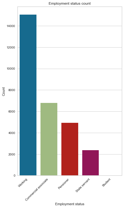
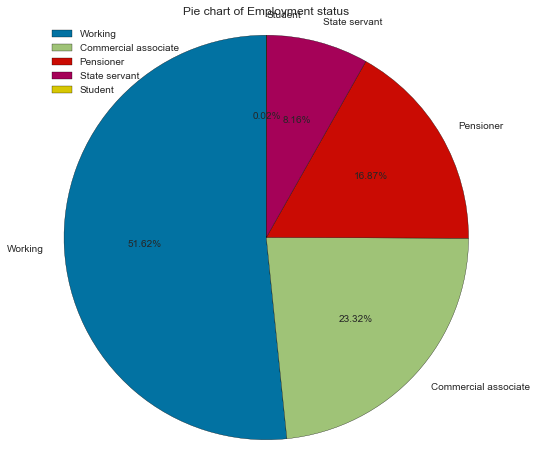
Employment status
Most applicants are working (51.62%); the next most represented status is commercial associate, followed by the pensioner.
gen_info_feat(cc_train_copy,'Employment status')
Description:
count       29165
unique          5
top       Working
freq        15056
Name: Employment status, dtype: object
**************************************************
Object type:
object
**************************************************
Value count:
                      Count  Frequency (%)
Working               15056          51.62
Commercial associate   6801          23.32
Pensioner              4920          16.87
State servant          2381           8.16
Student                   7           0.02
create_bar_plot(cc_train_copy,'Employment status')
create_pie_plot(cc_train_copy,'Employment status')
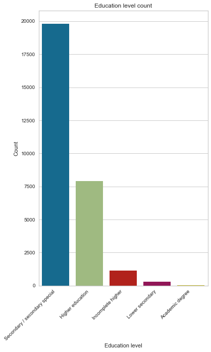
Education level
Most applicants have completed their secondary degree (67.90%) ¼ completed their higher education.
gen_info_feat(cc_train_copy,'Education level')
Description:
count                             29165
unique                                5
top       Secondary / secondary special
freq                              19803
Name: Education level, dtype: object
**************************************************
Object type:
object
**************************************************
Value count:
                               Count  Frequency (%)
Secondary / secondary special  19803          67.90
Higher education                7910          27.12
Incomplete higher               1129           3.87
Lower secondary                  298           1.02
Academic degree                   25           0.09
create_pie_plot(cc_train_copy,'Education level')

create_bar_plot(cc_train_copy,'Education level')
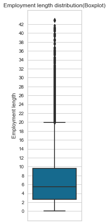
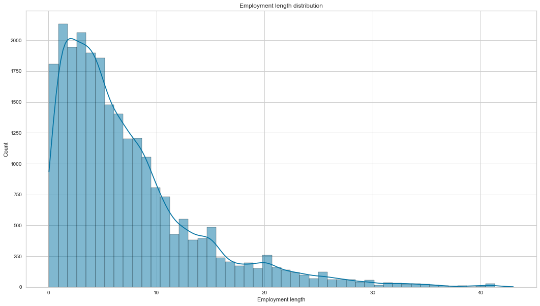
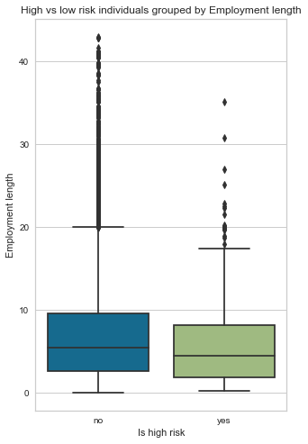
Employment length
Most applicants have been working between 5 to 7 years on average, and we also have many outliers who have been working for more than 20 years+. The employment length histogram is positively skewed. Finally, bad clients have a low employment length of 5 versus 7 years for good clients.
gen_info_feat(cc_train_copy,'Employment length')
Description:
count   24257.00
mean        7.26
std         6.46
min         0.05
25%         2.68
50%         5.45
75%         9.60
max        43.02
Name: Employment length, dtype: float64
**************************************************
Object type:int64
Description:
count    29165.00
mean     59257.76
std     137655.88
min     -15713.00
25%      -3153.00
50%      -1557.00
75%       -412.00
max     365243.00
Name: Employment length, dtype: float64
**************************************************
Object type:
int64
**************************************************
Value count:
         Count  Frequency (%)
 365243   4908          16.83
-401        61           0.21
-200        55           0.19
-2087       53           0.18
-1539       51           0.17
...        ...            ...
-8369        1           0.00
-6288        1           0.00
-6303        1           0.00
-3065        1           0.00
-8256        1           0.00

[3483 rows x 2 columns]
create_box_plot(cc_train_copy,'Employment length')
create_hist_plot(cc_train_copy,'Employment length')
- bivariate analysis with target variable
# distribution of employment length for good vs bad client
# Here 0 means No and 1 means Yes
low_high_risk_box_plot(cc_train_copy,'Employment length')
Is high risk
0   7.29
1   5.75
Name: Employment length, dtype: float64
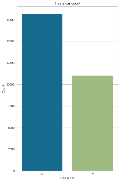
Has a car
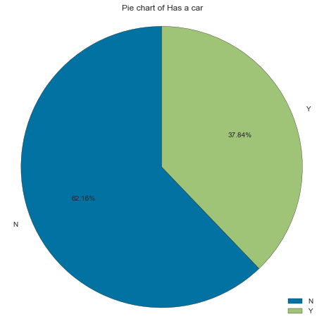
Most applicants don’t own a car (62% of applicants).
gen_info_feat(cc_train_copy,'Has a car')
Description:
count     29165
unique        2
top           N
freq      18128
Name: Has a car, dtype: object
**************************************************
Object type:
object
**************************************************
Value count:
   Count  Frequency (%)
N  18128          62.16
Y  11037          37.84
create_bar_plot(cc_train_copy,'Has a car')
create_pie_plot(cc_train_copy,'Has a car')
Has a property
Most applicants own a property (67% of applicants)
gen_info_feat(cc_train_copy,'Has a property')
Description:
count     29165
unique        2
top           Y
freq      19557
Name: Has a property, dtype: object
**************************************************
Object type:
object
**************************************************
Value count:
   Count  Frequency (%)
Y  19557          67.06
N   9608          32.94
create_bar_plot(cc_train_copy,'Has a property')
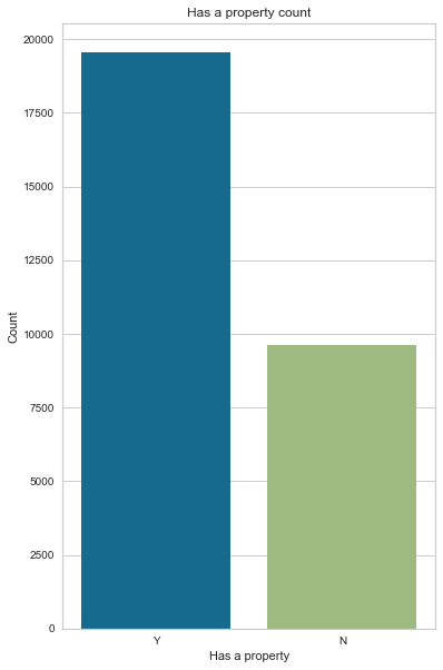
create_pie_plot(cc_train_copy,'Has a property')

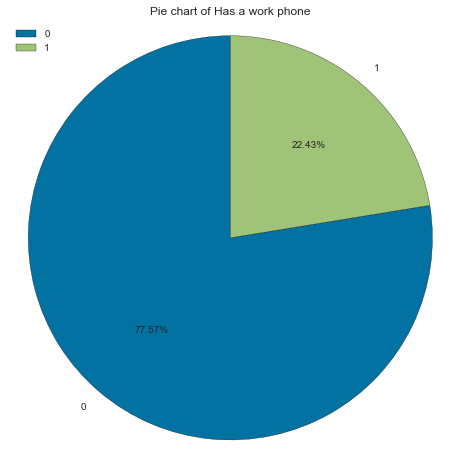
Has a work phone
More than ¾ of applicants don’t have a work phone
Note: Here, 0 represent no and 1 represents yes
gen_info_feat(cc_train_copy,'Has a work phone')
Description:
count   29165.00
mean        0.22
std         0.42
min         0.00
25%         0.00
50%         0.00
75%         0.00
max         1.00
Name: Has a work phone, dtype: float64
**************************************************
Object type:
int64
**************************************************
Value count:
   Count  Frequency (%)
0  22623          77.57
1   6542          22.43
create_bar_plot(cc_train_copy,'Has a work phone')
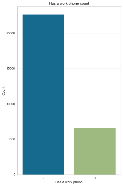
create_pie_plot(cc_train_copy,'Has a work phone')
Has a mobile phone
All the applicants, without exception, have a mobile phone.
Note: Here, 0 is no and 1 is yes
gen_info_feat(cc_train_copy,'Has a mobile phone')
Description:
count   29165.00
mean        1.00
std         0.00
min         1.00
25%         1.00
50%         1.00
75%         1.00
max         1.00
Name: Has a mobile phone, dtype: float64
**************************************************
Object type:
int64
**************************************************
Value count:
   Count  Frequency (%)
1  29165         100.00
create_pie_plot(cc_train_copy,'Has a mobile phone')

Has a phone
70% of applicants don’t have a phone (probably a home phone)
Note: Here, 0 is no and 1 is yes
gen_info_feat(cc_train_copy,'Has a phone')
Description:
count   29165.00
mean        0.29
std         0.46
min         0.00
25%         0.00
50%         0.00
75%         1.00
max         1.00
Name: Has a phone, dtype: float64
**************************************************
Object type:
int64
**************************************************
Value count:
   Count  Frequency (%)
0  20562          70.50
1   8603          29.50
create_bar_plot(cc_train_copy,'Has a phone')
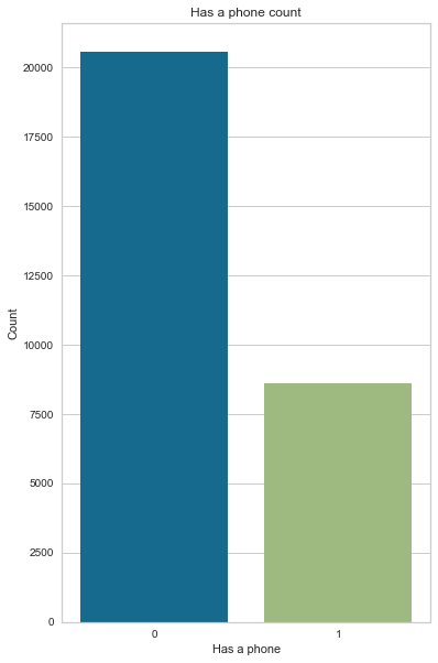
create_pie_plot(cc_train_copy,'Has a phone')

Has an email
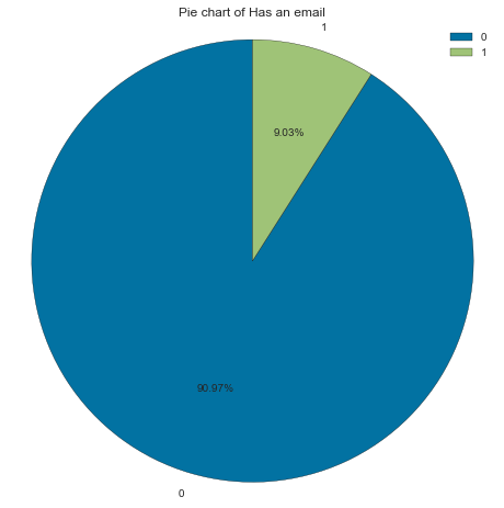
Interestingly, more than 90 % of applicants don’t have an email
Note: Here, 0 is no and 1 is yes
gen_info_feat(cc_train_copy,'Has an email')
Description:
count   29165.00
mean        0.09
std         0.29
min         0.00
25%         0.00
50%         0.00
75%         0.00
max         1.00
Name: Has an email, dtype: float64
**************************************************
Object type:
int64
**************************************************
Value count:
   Count  Frequency (%)
0  26532          90.97
1   2633           9.03
create_bar_plot(cc_train_copy,'Has an email')
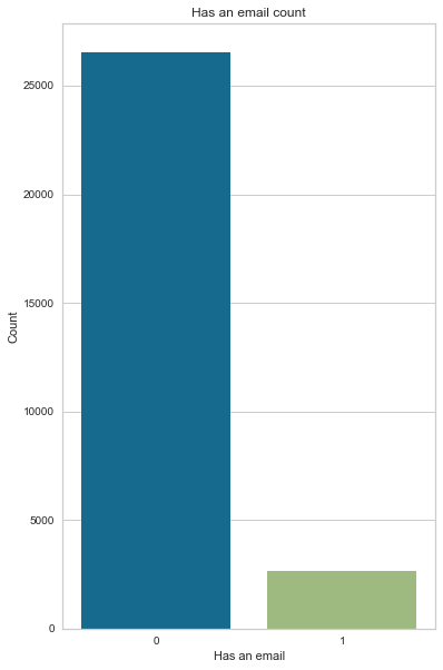
create_pie_plot(cc_train_copy,'Has an email')
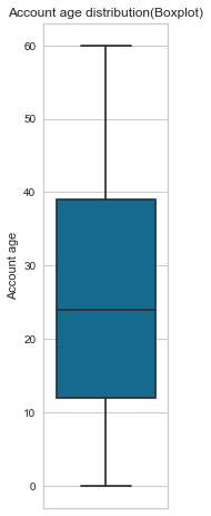
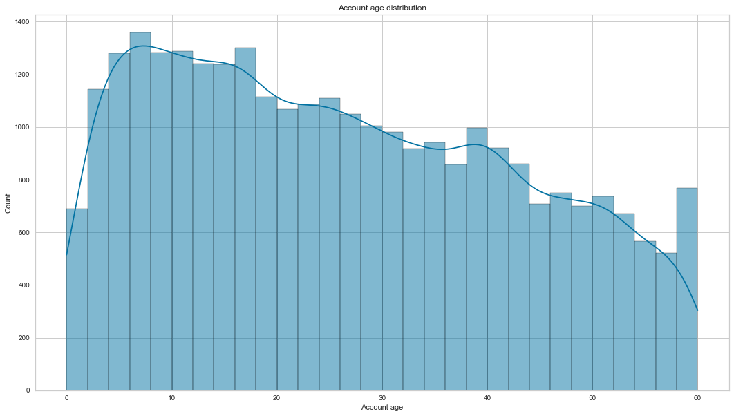
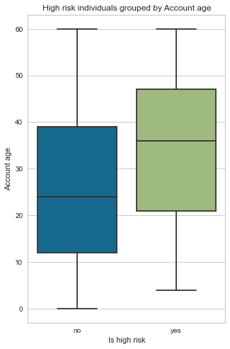
Account age
Most accounts are 26 months old. The account age feature is not normally distributed; it is positively skewed. Another observation is that, on average, bad clients’ accounts are 34 months old vs 26 months old for good clients’ accounts.
gen_info_feat(cc_train_copy,'Account age')
Description:
count   29165.00
mean       26.14
std        16.49
min         0.00
25%        12.00
50%        24.00
75%        39.00
max        60.00
Name: Account age, dtype: float64
**************************************************
Object type:float64
create_box_plot(cc_train_copy,'Account age')
create_hist_plot(cc_train_copy,'Account age', the_bins=30)
- bivariate analysis with target variable
low_high_risk_box_plot(cc_train_copy,'Account age')
Is high risk
0   26.00
1   34.04
Name: Account age, dtype: float64
Is high risk (target variable)
Most applicants are good clients (98% of applicants). We have imbalanced data that needs to be balanced using SMOTE before training on a model.
Note: Here, 0 is no and 1 is yes
gen_info_feat(cc_train_copy,'Is high risk')
Description:
count     29165
unique        2
top           0
freq      28666
Name: Is high risk, dtype: int64
**************************************************
Object type:
object
**************************************************
Value count:
   Count  Frequency (%)
0  28666          98.29
1    499           1.71
create_bar_plot(cc_train_copy,'Is high risk')
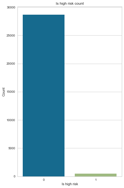
create_pie_plot(cc_train_copy,'Is high risk')

Bivariate analysis
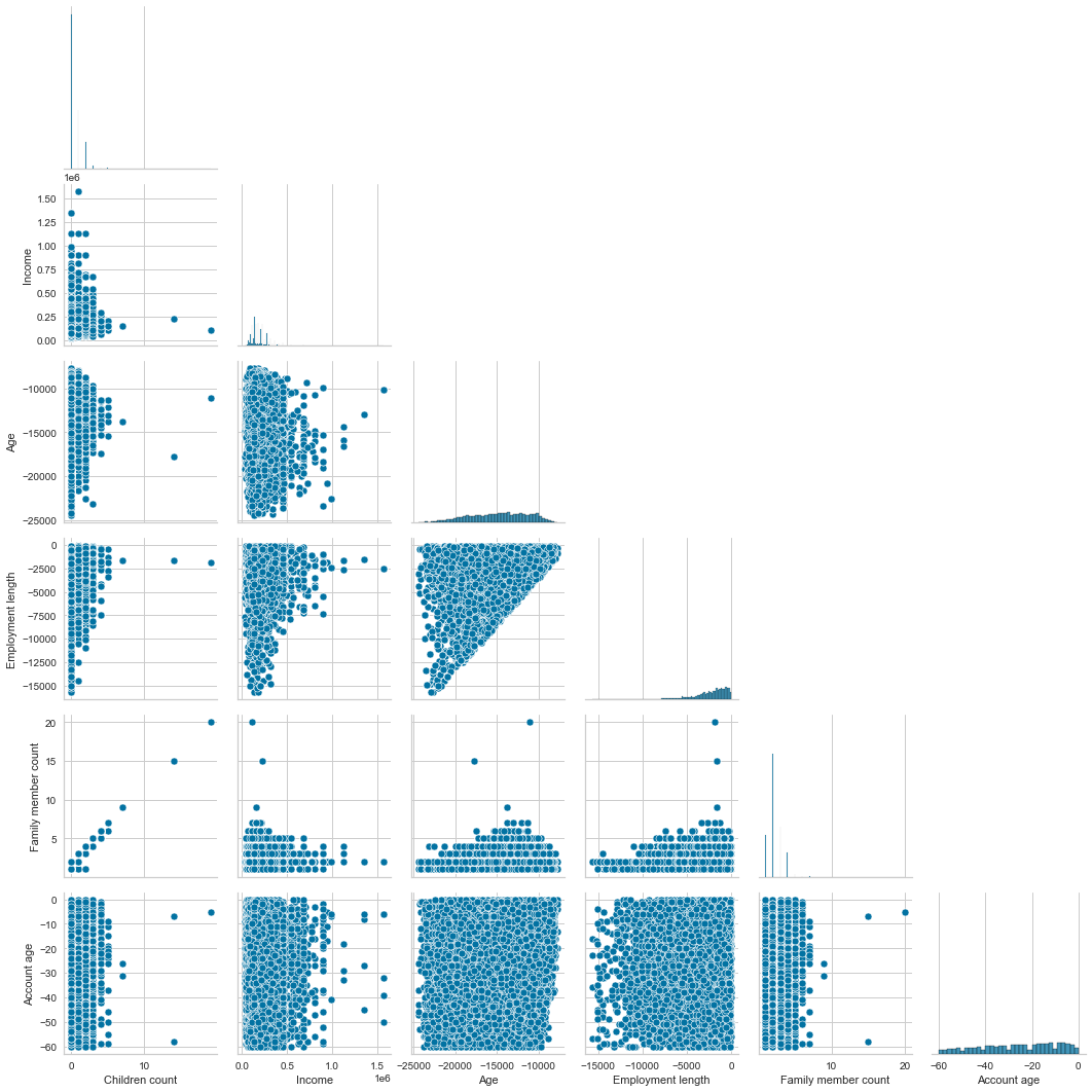
Now that we have finished our univariate analysis let’s look into the bivariate analysis. Bivariate analysis, as the name implies, is the analysis of two features compared with each other. First, we will do a bivariate analysis of numerical features.
Looking at the pairplot (scatter plots of pairwise relationships in a dataset), we can see a positive linear correlation between the family member and the children’s count. It makes sense; the more children someone has, the larger the family member count. It is a multicollinearity problem (two highly correlated features) which is not ideal for training a model. We will need to drop one of them.
Another trend is the Employment length and age. It also makes sense; the longer the employment length, the older someone is.
# drop categorical features, do a pairplot of the remaining feature numerical feature
sns.pairplot(cc_train_copy[cc_train_copy['Employment length'] < 0].drop(['ID','Has a mobile phone', 'Has a work phone', 'Has a phone', 'Has an email','Is high risk'],axis=1),corner=True)
plt.show()
Now let’s look at the two interesting scatter plots.
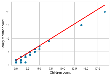
We will start with the family member count vs children count. Of course, the more children a person has, the larger the family count. We added a line of best fit, also called the regression line, and you can read more about it in this blog post here.
sns.regplot(x='Children count',y='Family member count',data=cc_train_copy,line_kws={'color': 'red'})
plt.show()
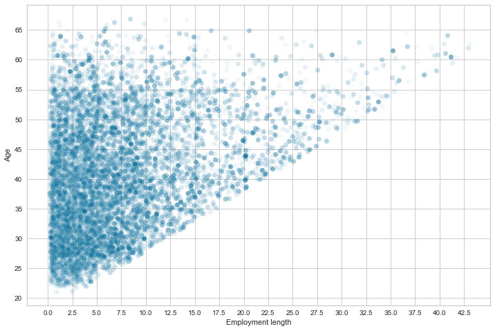
When we compare the employment length and age, the scatterplot shows a trend between the age and the length of employment.
It is shaped like a reversed triangle because the applicants’ age increases with the employment length. You can’t have an employment length that is superior to the age. Right?
y_age = np.abs(cc_train_copy['Age'])/365.25
x_employ_length = np.abs(
    cc_train_copy[cc_train_copy['Employment length'] < 0]['Employment length'])/365.25
fig, ax = plt.subplots(figsize=(12, 8))
sns.scatterplot(x_employ_length, y_age, alpha=.05)
# change the frequency of the x-axis and y-axis labels
plt.xticks(np.arange(0, x_employ_length.max(), 2.5))
plt.yticks(np.arange(20, y_age.max(), 5))
plt.show()
/Users/sternsemasuka/opt/anaconda3/lib/python3.9/site-packages/seaborn/_decorators.py:36: FutureWarning: Pass the following variables as keyword args: x, y. From version 0.12, the only valid positional argument will be `data`, and passing other arguments without an explicit keyword will result in an error or misinterpretation.
  warnings.warn(
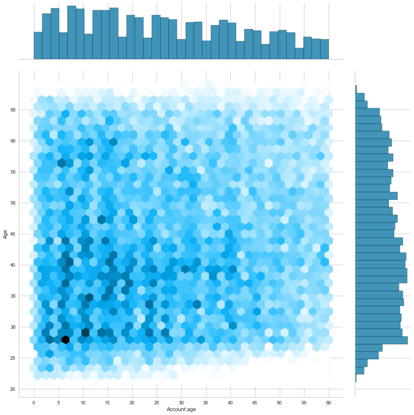
Now comparing account age and applicant age, we can see that most applicants are between 20 and 45 years old and have an account less than 25 months old. This information is deduced from darker blue hexagons (high-density area) between 22 and 43 on the Y axis and between 3 and 28 on the X axis.
sns.jointplot(np.abs(cc_train_copy['Account age']),y_age, kind="hex", height=12)
plt.yticks(np.arange(20, y_age.max(), 5))
plt.xticks(np.arange(0, 65, 5))
plt.ylabel('Age')
plt.show()
/Users/sternsemasuka/opt/anaconda3/lib/python3.9/site-packages/seaborn/_decorators.py:36: FutureWarning: Pass the following variables as keyword args: x, y. From version 0.12, the only valid positional argument will be `data`, and passing other arguments without an explicit keyword will result in an error or misinterpretation.
  warnings.warn(
Heatmap
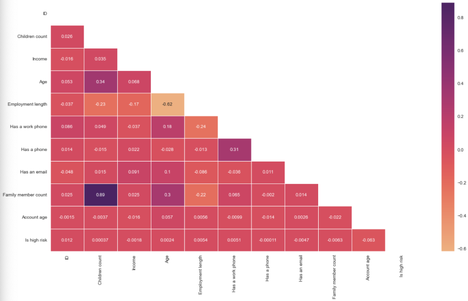
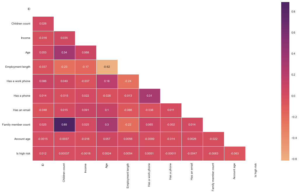
Time to do a correlation between all the numerical features using a heatmap. This heatmap shows the correlation between all the numerical features; the darker the cell, the more correlated the two features are, and the lighter the color, the less correlated the two features.
No feature is correlated with the target feature (Which is high risk). We see a strong correlation (0.89) between family member count and children count, as previously seen with the pairplot (The more children a person has, the larger the family count). Age has some positive correlation (0.30) with the family member count and children count. The older a person is, the most likely they will have a larger family and consequently more children.
Another positive correlation (0.31) is having a phone and having a work phone. We have a slightly positive correlation between age and work phone(0.18); younger people will be less likely to own a work phone. As previously discussed, we also have a negative (-0.62) between employment length and age.
# change the datatype of the target feature to int
is_high_risk_int = cc_train_copy['Is high risk'].astype('int32')
# correlation analysis with heatmap, after dropping the has a mobile phone with the target feature as int
cc_train_copy_corr_no_mobile = pd.concat([cc_train_copy.drop(['Has a mobile phone','Is high risk'], axis=1),is_high_risk_int],axis=1).corr()
# Get the lower triangle of the correlation matrix
# Generate a mask for the upper triangle
mask = np.zeros_like(cc_train_copy_corr_no_mobile, dtype='bool')
mask[np.triu_indices_from(mask)] = True
# Set up the matplotlib figure
fig, ax = plt.subplots(figsize=(18,10))
# seaborn heatmap
sns.heatmap(cc_train_copy_corr_no_mobile, annot=True, cmap='flare',mask=mask, linewidths=.5)
# plot the heatmap
plt.show()
ANOVA
Now, let’s do an ANOVA (analysis of variance) between age and other categorical features.
But before we proceed, what is an ANOVA? ANOVA tells you if there are any statistical differences between the means of two or more independent features (categorical features).
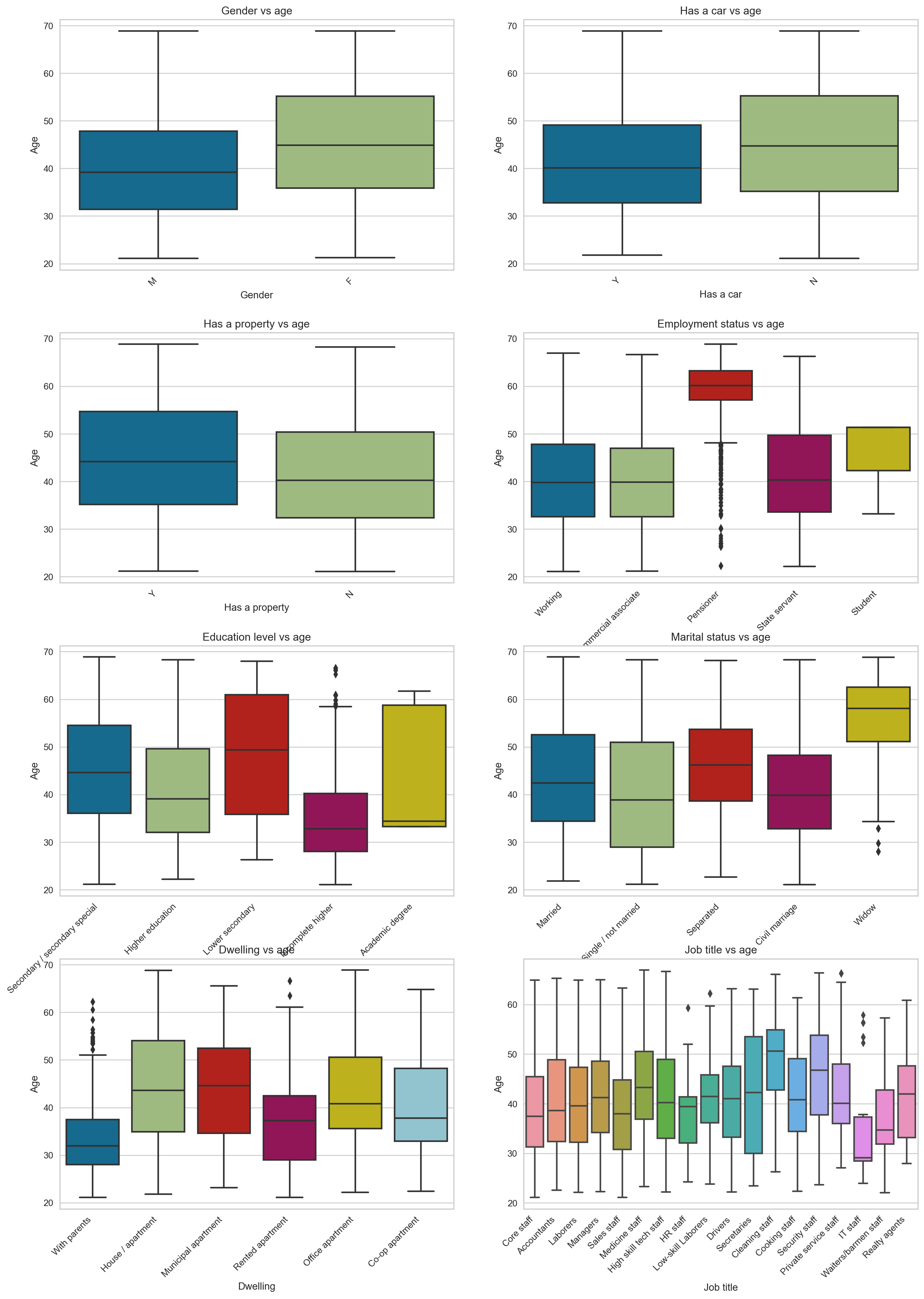
Now, let’s use box plots to compare age’s mean and different categorical features. Female applicants are older than their male counterparts, and those who don’t own a car with property owners tend to be older. Of course, the pensioners are older than those working (We also see that some have pensioned at a young age, those are outliers).
It is also interesting to see that those with an academic degree are generally younger than the other groups. The widows tend to be much older, with some young outliers in their 30s. Unsurprisingly, those who live with their parents tend to be younger, and we also see some outliers here. Lastly, those who work as cleaning staff tend to be older, while those who work in IT tend to be younger.
fig, axes = plt.subplots(4,2,figsize=(15,20),dpi=180)
fig.tight_layout(pad=5.0)
cat_features = ['Gender', 'Has a car', 'Has a property', 'Employment status', 'Education level', 'Marital status', 'Dwelling', 'Job title']
for cat_ft_count, ax in enumerate(axes):
    for row_count in range(4):
        for feat_count in range(2):
            sns.boxplot(ax=axes[row_count,feat_count],x=cc_train_copy[cat_features[cat_ft_count]],y=np.abs(cc_train_copy['Age'])/365.25)
            axes[row_count,feat_count].set_title(cat_features[cat_ft_count] + " vs age")
            plt.sca(axes[row_count,feat_count])
            plt.xticks(rotation=45,ha='right')
            plt.ylabel('Age')
            cat_ft_count += 1
    break
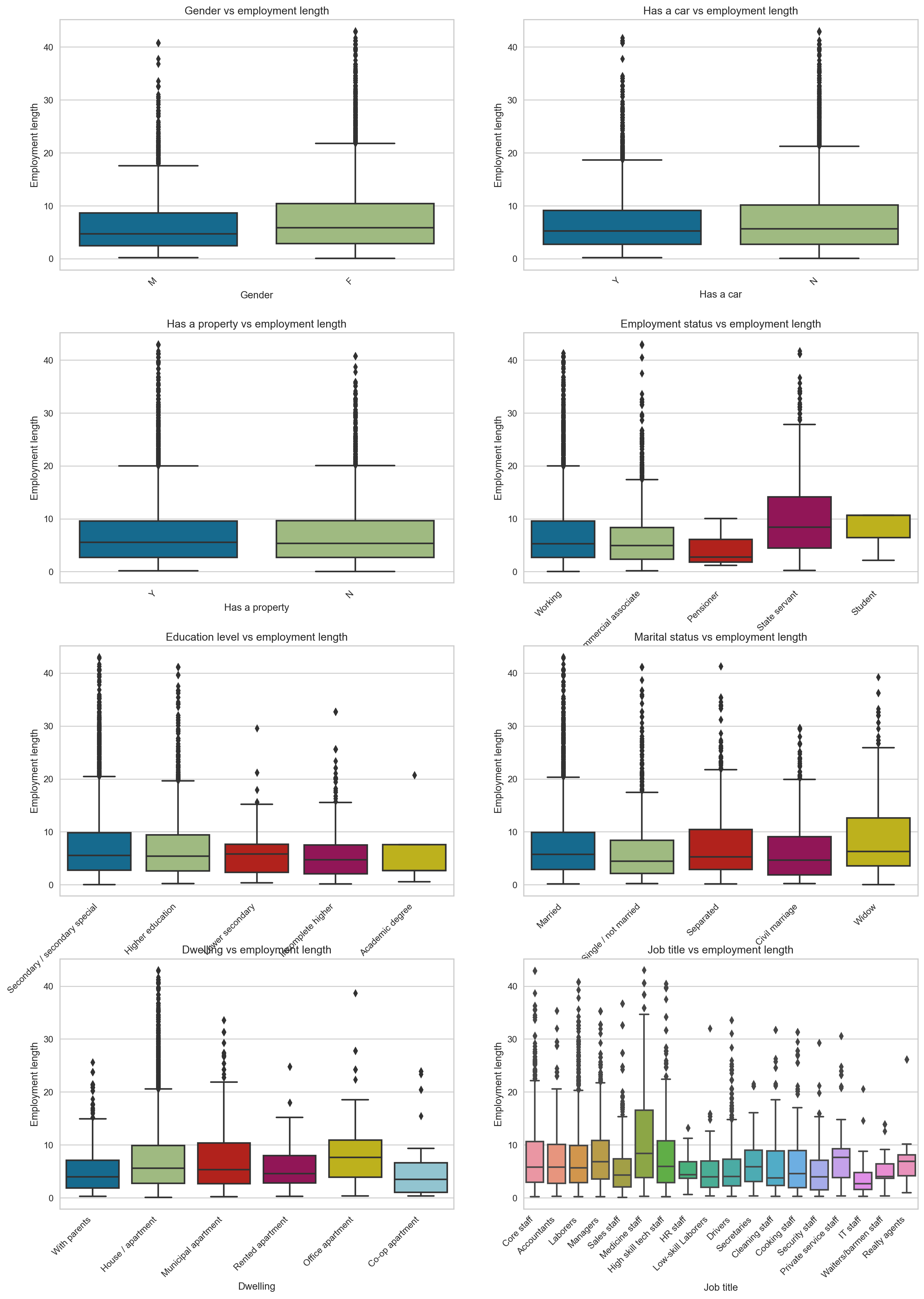
Now let’s turn our attention to employment length versus categorical features. The only interesting observation is that state-employed and medical staff applicants tend to have been employed longer than the rest.
fig, axes = plt.subplots(4,2,figsize=(15,20),dpi=180)
fig.tight_layout(pad=5.0)

for cat_ft_count, ax in enumerate(axes):
    for row_count in range(4):
        for feat_count in range(2):
            sns.boxplot(ax=axes[row_count,feat_count],x=cc_train_copy[cat_features[cat_ft_count]],y=np.abs(cc_train_copy[cc_train_copy['Employment length'] < 0]['Employment length'])/365.25)
            axes[row_count,feat_count].set_title(cat_features[cat_ft_count] + " vs employment length")
            plt.sca(axes[row_count,feat_count])
            plt.ylabel('Employment length')
            plt.xticks(rotation=45,ha='right')
            cat_ft_count += 1
    break
Applicant general profile
After analyzing each feature, we can create a typical credit card applicant profile. Here is the profile:
- Typical profile of an applicant is a Female in her early 40’s, married with a partner and no child. She has been employed for five years with a salary of 157500. She has completed her secondary education. She does not own a car but owns a property (a house/ apartment). Her account is 26 months old.
- Age and income do not have any effects on the target variable
- Those flagged as bad clients tend to have a shorter employment length and older accounts. They also constitute less than 2% of total applicants.
- Most applicants are 20 to 45 years old and have an account that is 30 months old or less.
3. Prepare the data
Using EDA, here is a list of all the transformations that need to be done on each feature:
ID:
- Drop the feature
Gender:
- One hot encoding
Age:
- Min-max scaling
- Fix skewness
- Absolute values and divide by 365.25
Marital status:
- One hot encoding
Family member count
- Fix outliers
Children count
- Fix outliers
- Drop feature
Dwelling type
- One hot encoding
Income
- Remove outliers
- Fix skewness
- Min-max scaling
Job title
- One hot encoding
- Impute missing values
Employment status:
- One hot encoding
Education level:
- Ordinal encoding
Employment length:
- Remove outliers
- Min-max scaling
- Absolute values and divide by 365.25
- change days of employment of retirees to 0
Has a car:
- Change it to numerical
- One-hot encoding
Has a property:
- Change it to numerical
- One-hot encoding
Has a mobile phone:
- Drop feature
Has a work phone:
- One-hot encoding
Has a phone:
- One-hot encoding
Has an email:
- One-hot encoding
Account age:
- Drop feature
Is high risk(Target):
- Change the data type to numerical
- balance the data with SMOTE
Data Cleaning
Here we are creating a class to handle outliers. But why do we have to remove the outliers?
Outliers are data points that differ significantly from other observations in the dataset. Outliers can spoil and mislead the training process resulting in longer training times, less accurate models and ultimately poorer results, which means that outliers must remove from the dataset.
This class will remove outliers more or less than 3 inter-quantile ranges away from the mean. This class will be the first class in the scikit-learn Pipeline to call.
Note: Refer to this picture below to understand IQR. In the image below, 1.5 IQR is used; in our case, we use 3 IQR, which is more sensitive to extreme outliers than 1.5 IQR.
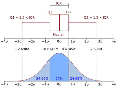
Image credit: Research gate
class OutlierRemover(BaseEstimator, TransformerMixin):
    def __init__(self,feat_with_outliers = ['Family member count','Income', 'Employment length']):
        # initializing the instance of the object
        self.feat_with_outliers = feat_with_outliers
    def fit(self,df):
        return self
    def transform(self,df):
        # check if the feature in part of the dataset's features
        if (set(self.feat_with_outliers).issubset(df.columns)):
            # 25% quantile
            Q1 = df[self.feat_with_outliers].quantile(.25)
            # 75% quantile
            Q3 = df[self.feat_with_outliers].quantile(.75)
            IQR = Q3 - Q1
            # keep the data within 3 IQR only and discard the rest
            df = df[~((df[self.feat_with_outliers] < (Q1 - 3 * IQR)) |(df[self.feat_with_outliers] > (Q3 + 3 * IQR))).any(axis=1)]
            return df
        else:
            print("One or more features are not in the dataframe")
            return df
Feature selection
Next is feature selection; here, we will drop the features that we judge are not useful in our prediction. Note this is not a feature selection based on the model coefficients or feature importance; it is purely based on logic.
The features to be dropped are ID, has a mobile phone, children count, job title, account age.
Now the next question is, why are we dropping these features?
- ID: ID is not helpful for prediction, it helped us when we were merging the two datasets, but after that, there is no need to keep it.
- Has a mobile phone: Since everyone has a mobile phone, this feature does not inform us about anything and is useless for the model.
- Children count: is highly correlated with Family member count, and to avoid multicollinearity, we will drop it.
- Job title: Has some missing values and the count of each category is not very different to justify using the mode to fill the missing values. So we drop it.
- Account age: Because Account age is used to create the target, reusing it will make our model overfit. Plus, this information is unknown while applying for a credit card and is not a predictor feature.
class DropFeatures(BaseEstimator,TransformerMixin):
    def __init__(self,feature_to_drop = ['ID','Has a mobile phone','Children count','Job title','Account age']):
        self.feature_to_drop = feature_to_drop
    def fit(self,df):
        return self
    def transform(self,df):
        if (set(self.feature_to_drop).issubset(df.columns)):
            # drop the list of features
            df.drop(self.feature_to_drop,axis=1,inplace=True)
            return df
        else:
            print("One or more features are not in the dataframe")
            return df
Feature engineering
This class will convert the features that use days (Employment length, Age) to absolute value because we can’t have negative days of employment.
class TimeConversionHandler(BaseEstimator, TransformerMixin):
    def __init__(self, feat_with_days = ['Employment length', 'Age']):
        self.feat_with_days = feat_with_days
    def fit(self, X, y=None):
        return self
    def transform(self, X, y=None):
        if (set(self.feat_with_days).issubset(X.columns)):
            # convert days to absolute value using NumPy
            X[['Employment length','Age']] = np.abs(X[['Employment length','Age']])
            return X
        else:
            print("One or more features are not in the dataframe")
            return X
The following class will convert the employment length of retirees (set to 365243) to 0 so that it is not considered an outlier.
class RetireeHandler(BaseEstimator, TransformerMixin):
    def __init__(self):
        pass
    def fit(self, df):
        return self
    def transform(self, df):
        if 'Employment length' in df.columns:
            # select rows with an employment length is 365243, which corresponds to retirees
            df_ret_idx = df['Employment length'][df['Employment length'] == 365243].index
            # set those rows with value 365243 to 0
            df.loc[df_ret_idx,'Employment length'] = 0
            return df
        else:
            print("Employment length is not in the dataframe")
            return df
Using the cubic root transformation, this class will reduce income and age distribution skewness. Skewed features negatively affect our predictive model’s performance, and machine learning models perform better with normally distributed data.
class SkewnessHandler(BaseEstimator, TransformerMixin):
    def __init__(self,feat_with_skewness=['Income','Age']):
        self.feat_with_skewness = feat_with_skewness
    def fit(self,df):
        return self
    def transform(self,df):
        if (set(self.feat_with_skewness).issubset(df.columns)):
            # Handle skewness with cubic root transformation
            df[self.feat_with_skewness] = np.cbrt(df[self.feat_with_skewness])
            return df
        else:
            print("One or more features are not in the dataframe")
            return df
This class will change 1 to the character “Y” and 0 to “N,” which will be more comprehensive when we do a one-hot encoding for these features Has a work phone, Has a phone, Has an email.
class BinningNumToYN(BaseEstimator, TransformerMixin):
    def __init__(self,feat_with_num_enc=['Has a work phone','Has a phone','Has an email']):
        self.feat_with_num_enc = feat_with_num_enc
    def fit(self,df):
        return self
    def transform(self,df):
        if (set(self.feat_with_num_enc).issubset(df.columns)):
            # Change 0 to N and 1 to Y for all the features in feat_with_num_enc
            for ft in self.feat_with_num_enc:
                df[ft] = df[ft].map({1:'Y',0:'N'})
            return df
        else:
            print("One or more features are not in the dataframe")
            return df
This class will do one-hot encoding on the categorical features, but also this class will keep the names of the features. We want to keep the feature names instead of an array without names (default) because the feature names will be used for feature importance.
class OneHotWithFeatNames(BaseEstimator,TransformerMixin):
    def __init__(self,one_hot_enc_ft = ['Gender', 'Marital status', 'Dwelling', 'Employment status', 'Has a car', 'Has a property', 'Has a work phone', 'Has a phone', 'Has an email']):
        self.one_hot_enc_ft = one_hot_enc_ft
    def fit(self,df):
        return self
    def transform(self,df):
        if (set(self.one_hot_enc_ft).issubset(df.columns)):
            # function to one-hot encode the features
            def one_hot_enc(df,one_hot_enc_ft):
                # instantiate the OneHotEncoder object
                one_hot_enc = OneHotEncoder()
                # fit the dataframe with the features we want to one-hot encode
                one_hot_enc.fit(df[one_hot_enc_ft])
                # get output feature names for transformation.
                feat_names_one_hot_enc = one_hot_enc.get_feature_names_out(one_hot_enc_ft)
                # change the one hot encoding array to a dataframe with the column names
                df = pd.DataFrame(one_hot_enc.transform(df[self.one_hot_enc_ft]).toarray(),columns=feat_names_one_hot_enc,index=df.index)
                return df
            # function to concatenate the one hot encoded features with the rest of the features that were not encoded
            def concat_with_rest(df,one_hot_enc_df,one_hot_enc_ft):
                # get the rest of the features that are not encoded
                rest_of_features = [ft for ft in df.columns if ft not in one_hot_enc_ft]
                # concatenate the rest of the features with the one hot encoded features
                df_concat = pd.concat([one_hot_enc_df, df[rest_of_features]],axis=1)
                return df_concat
            # call the one_hot_enc function and stores the dataframe in the one_hot_enc_df variable
            one_hot_enc_df = one_hot_enc(df,self.one_hot_enc_ft)
            # returns the concatenated dataframe and stores it in the full_df_one_hot_enc variable
            full_df_one_hot_enc = concat_with_rest(df,one_hot_enc_df,self.one_hot_enc_ft)
            return full_df_one_hot_enc
        else:
            print("One or more features are not in the dataframe")
            return df
This class will convert the education level to an ordinal encoding. Here we use ordinal encoding instead of one-hot encoding because we know that the education level is ranked (University is higher than primary school).
class OrdinalFeatNames(BaseEstimator,TransformerMixin):
    def __init__(self,ordinal_enc_ft = ['Education level']):
        self.ordinal_enc_ft = ordinal_enc_ft
    def fit(self,df):
        return self
    def transform(self,df):
        if 'Education level' in df.columns:
            # instantiate the OrdinalEncoder object
            ordinal_enc = OrdinalEncoder()
            df[self.ordinal_enc_ft] = ordinal_enc.fit_transform(df[self.ordinal_enc_ft])
            return df
        else:
            print("Education level is not in the dataframe")
            return df
This class will scale the feature using min-max scaling while keeping the feature names. You may ask why we have to scale. Well, some of the numerical features range from 0 to 20 (Family member count) while others range from 27000 to 1575000 (Income), so this means that some machine learning algorithms will weight the features with big numbers more than the feature with smaller numbers which should not be the case. So scaling all the numerical feature on the same scale (0 to 1) solve this issue.
class MinMaxWithFeatNames(BaseEstimator,TransformerMixin):
    def __init__(self,min_max_scaler_ft = ['Age', 'Income', 'Employment length']):
        self.min_max_scaler_ft = min_max_scaler_ft
    def fit(self,df):
        return self
    def transform(self,df):
        if (set(self.min_max_scaler_ft).issubset(df.columns)):
            # instantiate the MinMaxScaler object
            min_max_enc = MinMaxScaler()
            # fit and transform on a scale 0 to 1
            df[self.min_max_scaler_ft] = min_max_enc.fit_transform(df[self.min_max_scaler_ft])
            return df
        else:
            print("One or more features are not in the dataframe")
            return df
This class will change the data type of the target variable to numerical as it is an object data type even though it is 0 and 1’s (0 and 1’s expressed as strings)
class ChangeToNumTarget(BaseEstimator,TransformerMixin):
    def __init__(self):
        pass
    def fit(self,df):
        return self
    def transform(self,df):
        # check if the target is part of the dataframe
        if 'Is high risk' in df.columns:
            # change to a numeric data type using Pandas
            df['Is high risk'] = pd.to_numeric(df['Is high risk'])
            return df
        else:
            print("Is high risk is not in the dataframe")
            return df
This class will oversample the target variable using SMOTE because the minority class (Is high risk = 1) is scarce in the data, as we have seen while doing EDA of the target variable (1 only accounts for about 1.71% of the total data while 0 represent 98.29%).
class Oversample(BaseEstimator,TransformerMixin):
    def __init__(self):
        pass
    def fit(self,df):
        return self
    def transform(self,df):
        if 'Is high risk' in df.columns:
            # smote function instantiation to oversample the minority class to fix the imbalance data
            oversample = SMOTE(sampling_strategy='minority')
            # fit and resample the classes and assign them to X_bal, y_bal variable
            X_bal, y_bal = oversample.fit_resample(df.loc[:, df.columns != 'Is high risk'],df['Is high risk'])
            # concatenate the balanced classes column-wise
            df_bal = pd.concat([pd.DataFrame(X_bal),pd.DataFrame(y_bal)],axis=1)
            return df_bal
        else:
            print("Is high risk is not in the dataframe")
            return df
Data Preprocessing
Now we are ready to create the data preprocessing pipeline using the built sklearn function Pipeline. This function calls each class in the pipeline sequentially, starting from the outlier remover to the oversample class. The dataset will be transformed consecutively from the first class to the next one till the end. The pipeline will be stored in a variable called pipeline and will call fit_transform on that variable, pass our dataframe we want to transform and return the result.
def full_pipeline(df):
    # Create the pipeline that will call all the classes from OutlierRemoval() to Oversample() in one go
    pipeline = Pipeline([
        ('outlier_remover', OutlierRemover()),
        ('feature_dropper', DropFeatures()),
        ('time_conversion_handler', TimeConversionHandler()),
        ('retiree_handler', RetireeHandler()),
        ('skewness_handler', SkewnessHandler()),
        ('binning_num_to_yn', BinningNumToYN()),
        ('one_hot_with_feat_names', OneHotWithFeatNames()),
        ('ordinal_feat_names', OrdinalFeatNames()),
        ('min_max_with_feat_names', MinMaxWithFeatNames()),
        ('change_to_num_target', ChangeToNumTarget()),
        ('oversample', Oversample())
    ])
    df_pipe_prep = pipeline.fit_transform(df)
    return df_pipe_prep
Now we pass in the training dataset.
pd.options.mode.chained_assignment = None  # Hide the warnings
cc_train_prep = full_pipeline(cc_train_copy)
We check how many rows and columns we have after the transformation.
cc_train_prep.shape
(46544, 34)
Let’s quickly look at the first few rows of the transformed dataframe. We can see that the columns’ names have been kept, and all the transformations have taken place.
pd.set_option('display.max_columns', None)
cc_train_prep.head()
| Gender_F | Gender_M | Marital status_Civil marriage | Marital status_Married | Marital status_Separated | Marital status_Single / not married | Marital status_Widow | Dwelling_Co-op apartment | Dwelling_House / apartment | Dwelling_Municipal apartment | Dwelling_Office apartment | Dwelling_Rented apartment | Dwelling_With parents | Employment status_Commercial associate | Employment status_Pensioner | Employment status_State servant | Employment status_Student | Employment status_Working | Has a car_N | Has a car_Y | Has a property_N | Has a property_Y | Has a work phone_N | Has a work phone_Y | Has a phone_N | Has a phone_Y | Has an email_N | Has an email_Y | Income | Education level | Age | Employment length | Family member count | Is high risk | |
|---|---|---|---|---|---|---|---|---|---|---|---|---|---|---|---|---|---|---|---|---|---|---|---|---|---|---|---|---|---|---|---|---|---|---|
| 0 | 0.00 | 1.00 | 0.00 | 1.00 | 0.00 | 0.00 | 0.00 | 0.00 | 0.00 | 0.00 | 0.00 | 0.00 | 1.00 | 0.00 | 0.00 | 0.00 | 0.00 | 1.00 | 0.00 | 1.00 | 0.00 | 1.00 | 1.00 | 0.00 | 1.00 | 0.00 | 1.00 | 0.00 | 0.42 | 4.00 | 0.60 | 0.27 | 2.00 | 0 |
| 1 | 1.00 | 0.00 | 0.00 | 0.00 | 0.00 | 1.00 | 0.00 | 0.00 | 1.00 | 0.00 | 0.00 | 0.00 | 0.00 | 1.00 | 0.00 | 0.00 | 0.00 | 0.00 | 0.00 | 1.00 | 1.00 | 0.00 | 1.00 | 0.00 | 1.00 | 0.00 | 1.00 | 0.00 | 0.42 | 1.00 | 0.20 | 0.14 | 2.00 | 0 |
| 2 | 1.00 | 0.00 | 0.00 | 1.00 | 0.00 | 0.00 | 0.00 | 0.00 | 1.00 | 0.00 | 0.00 | 0.00 | 0.00 | 1.00 | 0.00 | 0.00 | 0.00 | 0.00 | 1.00 | 0.00 | 0.00 | 1.00 | 1.00 | 0.00 | 1.00 | 0.00 | 1.00 | 0.00 | 0.52 | 4.00 | 0.39 | 0.50 | 4.00 | 0 |
| 3 | 1.00 | 0.00 | 0.00 | 0.00 | 0.00 | 1.00 | 0.00 | 0.00 | 1.00 | 0.00 | 0.00 | 0.00 | 0.00 | 1.00 | 0.00 | 0.00 | 0.00 | 0.00 | 0.00 | 1.00 | 0.00 | 1.00 | 1.00 | 0.00 | 1.00 | 0.00 | 0.00 | 1.00 | 0.81 | 1.00 | 0.84 | 0.18 | 1.00 | 0 |
| 4 | 1.00 | 0.00 | 0.00 | 0.00 | 1.00 | 0.00 | 0.00 | 0.00 | 1.00 | 0.00 | 0.00 | 0.00 | 0.00 | 0.00 | 0.00 | 0.00 | 0.00 | 1.00 | 1.00 | 0.00 | 1.00 | 0.00 | 1.00 | 0.00 | 0.00 | 1.00 | 1.00 | 0.00 | 0.68 | 4.00 | 0.60 | 0.04 | 1.00 | 0 |
Now, we extract the target variable Is high risk from the dataframe and create a new dataframe composed of independent features (also called predictor, aka all the features except the target variable) as X_cc_train_prep and the target variable as y_cc_train_prep.
# split the train data into X and y (target)
X_cc_train_prep, y_cc_train_prep = cc_train_prep.loc[:, cc_train_prep.columns != 'Is high risk'], cc_train_prep['Is high risk'].astype('int64')
X_cc_train_prep.head()
| Gender_F | Gender_M | Marital status_Civil marriage | Marital status_Married | Marital status_Separated | Marital status_Single / not married | Marital status_Widow | Dwelling_Co-op apartment | Dwelling_House / apartment | Dwelling_Municipal apartment | Dwelling_Office apartment | Dwelling_Rented apartment | Dwelling_With parents | Employment status_Commercial associate | Employment status_Pensioner | Employment status_State servant | Employment status_Student | Employment status_Working | Has a car_N | Has a car_Y | Has a property_N | Has a property_Y | Has a work phone_N | Has a work phone_Y | Has a phone_N | Has a phone_Y | Has an email_N | Has an email_Y | Income | Education level | Age | Employment length | Family member count | |
|---|---|---|---|---|---|---|---|---|---|---|---|---|---|---|---|---|---|---|---|---|---|---|---|---|---|---|---|---|---|---|---|---|---|
| 0 | 0.00 | 1.00 | 0.00 | 1.00 | 0.00 | 0.00 | 0.00 | 0.00 | 0.00 | 0.00 | 0.00 | 0.00 | 1.00 | 0.00 | 0.00 | 0.00 | 0.00 | 1.00 | 0.00 | 1.00 | 0.00 | 1.00 | 1.00 | 0.00 | 1.00 | 0.00 | 1.00 | 0.00 | 0.42 | 4.00 | 0.60 | 0.27 | 2.00 |
| 1 | 1.00 | 0.00 | 0.00 | 0.00 | 0.00 | 1.00 | 0.00 | 0.00 | 1.00 | 0.00 | 0.00 | 0.00 | 0.00 | 1.00 | 0.00 | 0.00 | 0.00 | 0.00 | 0.00 | 1.00 | 1.00 | 0.00 | 1.00 | 0.00 | 1.00 | 0.00 | 1.00 | 0.00 | 0.42 | 1.00 | 0.20 | 0.14 | 2.00 |
| 2 | 1.00 | 0.00 | 0.00 | 1.00 | 0.00 | 0.00 | 0.00 | 0.00 | 1.00 | 0.00 | 0.00 | 0.00 | 0.00 | 1.00 | 0.00 | 0.00 | 0.00 | 0.00 | 1.00 | 0.00 | 0.00 | 1.00 | 1.00 | 0.00 | 1.00 | 0.00 | 1.00 | 0.00 | 0.52 | 4.00 | 0.39 | 0.50 | 4.00 |
| 3 | 1.00 | 0.00 | 0.00 | 0.00 | 0.00 | 1.00 | 0.00 | 0.00 | 1.00 | 0.00 | 0.00 | 0.00 | 0.00 | 1.00 | 0.00 | 0.00 | 0.00 | 0.00 | 0.00 | 1.00 | 0.00 | 1.00 | 1.00 | 0.00 | 1.00 | 0.00 | 0.00 | 1.00 | 0.81 | 1.00 | 0.84 | 0.18 | 1.00 |
| 4 | 1.00 | 0.00 | 0.00 | 0.00 | 1.00 | 0.00 | 0.00 | 0.00 | 1.00 | 0.00 | 0.00 | 0.00 | 0.00 | 0.00 | 0.00 | 0.00 | 0.00 | 1.00 | 1.00 | 0.00 | 1.00 | 0.00 | 1.00 | 0.00 | 0.00 | 1.00 | 1.00 | 0.00 | 0.68 | 4.00 | 0.60 | 0.04 | 1.00 |
y_cc_train_prep.head()
0    0
1    0
2    0
3    0
4    0
Name: Is high risk, dtype: int64
Short-list promising models
Alright! the moment we have been all waiting for has finally arrived; time to train our models. We first create a dictionary of models and their corresponding names. This dictionary will be used to loop through all the models and train them without having to write them over and over again.
classifiers = {
    'sgd':SGDClassifier(random_state=42,loss='perceptron'),
    'logistic_regression':LogisticRegression(random_state=42,max_iter=1000),
    'support_vector_machine':SVC(random_state=42,probability=True),
    'decision_tree':DecisionTreeClassifier(random_state=42),
    'random_forest':RandomForestClassifier(random_state=42),
    'gaussian_naive_bayes':GaussianNB(),
    'k_nearest_neighbors':KNeighborsClassifier(),
    'gradient_boosting':GradientBoostingClassifier(random_state=42),
    'linear_discriminant_analysis':LinearDiscriminantAnalysis(),
    'bagging':BaggingClassifier(random_state=42),
    'neural_network':MLPClassifier(random_state=42,max_iter=1000),
    'adaboost':AdaBoostClassifier(random_state=42),
    'extra_trees':ExtraTreesClassifier(random_state=42),
    }
Now we will write some of the functions used for our training model. The first function is a function to plot the feature importance of the model. The feature importance is ranking features that contribute more(or less) than other features to the model prediction. The feature importance varies from one model to another.
def feat_importance_plot(model_trn, model_name):
    '''
    Function to get the feature importance of the classifier and plot it
    '''
    # in order to get the feature importance, the model should not be 'sgd','support_vector_machine','gaussian_naive_bayes','k_nearest_neighbors','bagging','neural_network'
    if model_name not in ['sgd','support_vector_machine','gaussian_naive_bayes','k_nearest_neighbors','bagging','neural_network']:
        # change xtick font size
        plt.rcParams['xtick.labelsize'] = 12
        plt.rcParams['ytick.labelsize'] = 12
        # top 10 most predictive features
        top_10_feat = FeatureImportances(model_trn, relative=False, topn=10)
        # top 10 least predictive features
        bottom_10_feat = FeatureImportances(model_trn, relative=False, topn=-10)
        # change the figure size
        plt.figure(figsize=(10, 4))
        # change x label font size
        plt.xlabel('xlabel', fontsize=14)
        # fit to get the feature importance
        top_10_feat.fit(X_cc_train_prep, y_cc_train_prep)
        # show the plot
        top_10_feat.show()
        print('\n')
        plt.figure(figsize=(10, 4))
        plt.xlabel('xlabel', fontsize=14)
        # fit to get the feature importance
        bottom_10_feat.fit(X_cc_train_prep, y_cc_train_prep)
        # show the plot
        bottom_10_feat.show()
        print('\n')
    else:
        print('No feature importance for {0}'.format(model_name))
        print('\n')
On the other hand, this function is used to get the y predictions of the model using cross-validation prediction with k fold equal to 10.
def y_prediction_func(model_trn,model_name,final_model=False):
    '''
    Function to get the y prediction
    '''
    if final_model == False:
        # check if y_train_copy_pred files exist; if not, create it
        y_cc_train_pred_path = Path('saved_models/{0}/y_train_copy_pred_{0}.sav'.format(model_name))
        try:
            y_cc_train_pred_path.resolve(strict=True)
        # if FileNotFoundError is raised
        except FileNotFoundError:
            # cross-validation prediction with kfold = 10
            y_cc_train_pred = cross_val_predict(model_trn,X_cc_train_prep,y_cc_train_prep,cv=10,n_jobs=-1)
            # save the predictions using joblib library
            joblib.dump(y_cc_train_pred,y_cc_train_pred_path)
            return y_cc_train_pred
        else:
            # if the file exists, load the predictions
            y_cc_train_pred = joblib.load(y_cc_train_pred_path)
            return y_cc_train_pred
    # When we are dealing with the final model
    else:
        # check if y_train_copy_pred files exist; if not, create it
        y_cc_train_pred_path_final = Path('saved_models_final/{0}/y_train_copy_pred_{0}_final.sav'.format(model_name))
        try:
            y_cc_train_pred_path_final.resolve(strict=True)
        except FileNotFoundError:
            # cross validation prediction with kfold = 10
            y_cc_train_pred_final = cross_val_predict(model_trn,X_cc_train_prep,y_cc_train_prep,cv=10,n_jobs=-1)
            # save the predictions
            joblib.dump(y_cc_train_pred_final,y_cc_train_pred_path_final)
            return y_cc_train_pred_final
        else:
            # if it exists load the predictions
            y_cc_train_pred_final = joblib.load(y_cc_train_pred_path_final)
            return y_cc_train_pred_final
This function will plot the confusion matrix for each of the algorithms.
def confusion_matrix_func(model_trn,model_name,final_model=False):
    '''
    Function to plot the confusion matrix
    '''
    if final_model == False:
        fig, ax = plt.subplots(figsize=(8,8))
        # plot confusion matrix
        conf_matrix = ConfusionMatrixDisplay.from_predictions(y_cc_train_prep,y_prediction_func(model_trn,model_name),ax=ax, cmap='Blues',values_format='d')
        # remove the grid
        plt.grid(visible=None)
        # increase the font size of the X and Y labels
        plt.xlabel('Predicted label', fontsize=14)
        plt.ylabel('True label', fontsize=14)
        # give a title to the plot using the model name
        plt.title('Confusion Matrix', fontsize=14)
        # show the plot
        plt.show()
        print('\n')
    # When we are dealing with the final model
    else:
        fig, ax = plt.subplots(figsize=(8,8))
        # plot confusion matrix
        conf_matrix_final = ConfusionMatrixDisplay.from_predictions(y_cc_train_prep,y_prediction_func(model_trn,model_name,final_model=True),ax=ax, cmap='Blues',values_format='d')
        # remove the grid
        plt.grid(visible=None)
        # increase the font size of the X and Y labels
        plt.xlabel('Predicted label', fontsize=14)
        plt.ylabel('True label', fontsize=14)
        # give a title to the plot using the model name
        plt.title('Confusion Matrix', fontsize=14)
        # show the plot
        plt.show()
        print('\n')
The following function will plot the ROC curve of each model.
def roc_curve_func(model_trn,model_name,final_model=False):
    '''
    Function to plot the roc curve
    '''
    if final_model == False:
        # check if the y probabilities file exists; if not create it
        y_proba_path = Path('saved_models/{0}/y_cc_train_proba_{0}.sav'.format(model_name))
        try:
            y_proba_path.resolve(strict=True)
        # if the FileNotFoundError is raised
        except FileNotFoundError:
            # calculate the y probability
            y_cc_train_proba = model_trn.predict_proba(X_cc_train_prep)
            # save y_cc_train_proba file at y_proba_path
            joblib.dump(y_cc_train_proba,y_proba_path)
        else:
            # if path exist load the y probabilities file
            y_cc_train_proba = joblib.load(y_proba_path)
        # plot the roc curve
        skplt.metrics.plot_roc(y_cc_train_prep, y_cc_train_proba, title = 'ROC curve for {0}'.format(model_name), cmap='cool',figsize=(8,6), text_fontsize='large')
        # remove the grid
        plt.grid(visible=None)
        plt.show()
        print('\n')
    # When we are dealing with the final model
    else:
        # check if y probabilities file exists, if not create it
        y_proba_path_final = Path('saved_models_final/{0}/y_cc_train_proba_{0}_final.sav'.format(model_name))
        try:
            y_proba_path_final.resolve(strict=True)
        except FileNotFoundError:
            y_cc_train_proba_final = model_trn.predict_proba(X_cc_train_prep)
            joblib.dump(y_cc_train_proba_final,y_proba_path_final)
        else:
            # if path exist load the y probabilities file
            y_cc_train_proba_final = joblib.load(y_proba_path_final)
        # plot the roc curve
        skplt.metrics.plot_roc(y_cc_train_prep, y_cc_train_proba_final, title = 'ROC curve for {0}'.format(model_name), cmap='cool',figsize=(8,6), text_fontsize='large')
        # remove the grid
        plt.grid(visible=None)
        plt.show()
        print('\n')
This other function will print the classification report. A classification report is a table that describes the performance of a classification model and has information like precision, recall, f1-score, support, accuracy.
def score_func(model_trn, model_name, final_model=False):
    '''
    Function to display the classification report
    '''
    if final_model == False:
        class_report = classification_report(y_cc_train_prep,y_prediction_func(model_trn,model_name))
        print(class_report)
    # When we are dealing with the final model
    else:
        class_report_final = classification_report(y_cc_train_prep,y_prediction_func(model_trn,model_name,final_model=True))
        print(class_report_final)
This function will train the models and save them in the saved_models and saved_models_final folders.
def train_model(model,model_name,final_model=False):
    '''
    Function to train and save the model
    '''
    # If we are not training the final model
    if final_model == False:
        # Check if the model file exists and if not, create, train and save it
        model_file_path = Path('saved_models/{0}/{0}_model.sav'.format(model_name))
        try:
            model_file_path.resolve(strict=True)
        except FileNotFoundError:
            if model_name == 'sgd':
                # for sgd, loss = 'hinge' does not have a predict_proba method. Therefore, we use a calibrated model
                calibrated_model = CalibratedClassifierCV(model, cv=10, method='sigmoid')
                # train the model
                model_trn = calibrated_model.fit(X_cc_train_prep,y_cc_train_prep)
            # For the rest of the models
            else:
                model_trn = model.fit(X_cc_train_prep,y_cc_train_prep)
            # save the model
            joblib.dump(model_trn,model_file_path)
            return model_trn
        else:
            # if path exist load the model
            model_trn = joblib.load(model_file_path)
            return model_trn
    else:
        # check if the final model file exist and if not create, train and save it
        final_model_file_path = Path('saved_models_final/{0}/{0}_model.sav'.format(model_name))
        try:
            final_model_file_path.resolve(strict=True)
        except FileNotFoundError:
            # train the model
            model_trn = model.fit(X_cc_train_prep,y_cc_train_prep)
            joblib.dump(model_trn,final_model_file_path)
            return model_trn
        else:
            # if path exist load the model
            model_trn = joblib.load(final_model_file_path)
            return model_trn
This function below will look at the folder_check_model which will check if saved_models folder exists; if not, it will create it.
def folder_check_model():
    # check if the folder for saving the model exists, if not create it
    if not os.path.exists('saved_models/{}'.format(model_name)):
        os.makedirs('saved_models/{}'.format(model_name))
# loop over all the models
for model_name,model in classifiers.items():
    # title formatting
    print('\n')
    print('\n')
    print('  {}  '.center(50,'-').format(model_name))
    print('\n')
    # check if the folder for saving the model exists; if not create it
    folder_check_model()
    # train the model
    model_trn = train_model(model,model_name)
    # print the scores from the classification report
    score_func(model_trn, model_name)
    # plot the ROC curve
    roc_curve_func(model_trn,model_name)
    # plot the confusion matrix
    confusion_matrix_func(model_trn,model_name)
    # plot feature importance
    feat_importance_plot(model_trn, model_name)
    warnings.filterwarnings("ignore")
----------------------  sgd  ----------------------


              precision    recall  f1-score   support

           0       0.57      0.61      0.59     23272
           1       0.58      0.54      0.56     23272

    accuracy                           0.58     46544
   macro avg       0.58      0.58      0.58     46544
weighted avg       0.58      0.58      0.58     46544
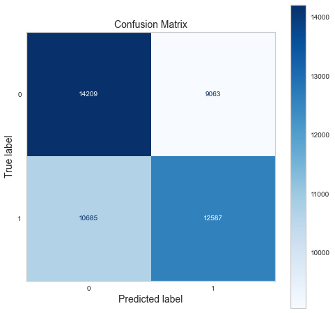
No feature importance for sgd


----------------------  logistic_regression  ----------------------


              precision    recall  f1-score   support

           0       0.59      0.57      0.58     23272
           1       0.59      0.61      0.60     23272

    accuracy                           0.59     46544
   macro avg       0.59      0.59      0.59     46544
weighted avg       0.59      0.59      0.59     46544
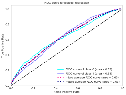
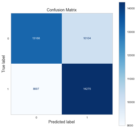
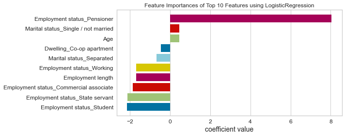
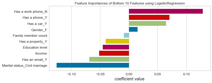
----------------------  support_vector_machine  ----------------------


              precision    recall  f1-score   support

           0       0.87      0.81      0.84     23272
           1       0.83      0.88      0.85     23272

    accuracy                           0.85     46544
   macro avg       0.85      0.85      0.85     46544
weighted avg       0.85      0.85      0.85     46544
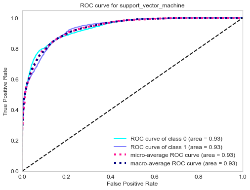
No feature importance for support_vector_machine


----------------------  decision_tree  ----------------------


              precision    recall  f1-score   support

           0       0.98      0.98      0.98     23272
           1       0.98      0.98      0.98     23272

    accuracy                           0.98     46544
   macro avg       0.98      0.98      0.98     46544
weighted avg       0.98      0.98      0.98     46544
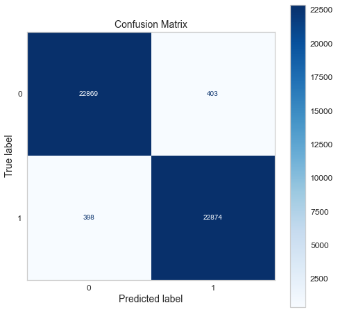
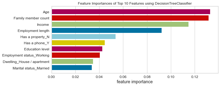
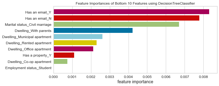
----------------------  random_forest  ----------------------


              precision    recall  f1-score   support

           0       0.99      0.99      0.99     23272
           1       0.99      0.99      0.99     23272

    accuracy                           0.99     46544
   macro avg       0.99      0.99      0.99     46544
weighted avg       0.99      0.99      0.99     46544
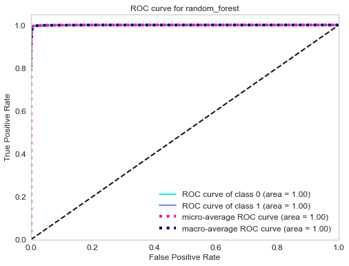

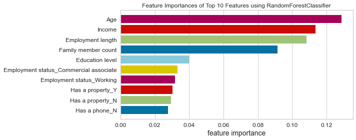
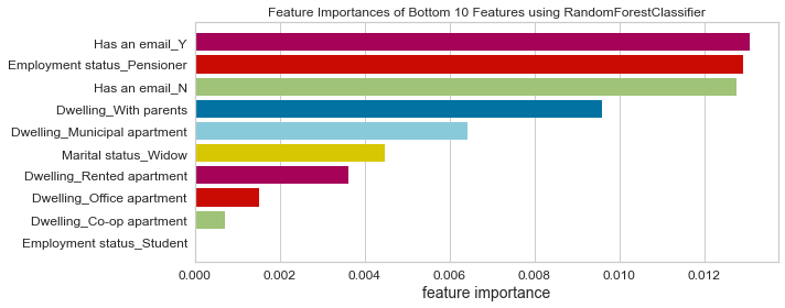
----------------------  gaussian_naive_bayes  ----------------------


              precision    recall  f1-score   support

           0       0.60      0.50      0.55     23272
           1       0.57      0.66      0.61     23272

    accuracy                           0.58     46544
   macro avg       0.58      0.58      0.58     46544
weighted avg       0.58      0.58      0.58     46544
No feature importance for gaussian_naive_bayes


----------------------  k_nearest_neighbors  ----------------------


              precision    recall  f1-score   support

           0       0.98      0.96      0.97     23272
           1       0.96      0.98      0.97     23272

    accuracy                           0.97     46544
   macro avg       0.97      0.97      0.97     46544
weighted avg       0.97      0.97      0.97     46544
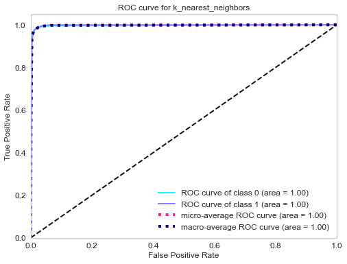

No feature importance for k_nearest_neighbors


----------------------  gradient_boosting  ----------------------


              precision    recall  f1-score   support

           0       0.90      0.90      0.90     23272
           1       0.90      0.90      0.90     23272

    accuracy                           0.90     46544
   macro avg       0.90      0.90      0.90     46544
weighted avg       0.90      0.90      0.90     46544
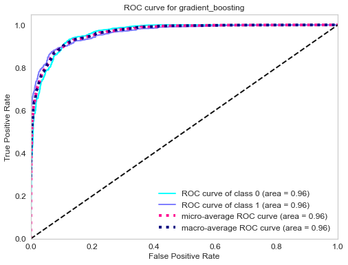
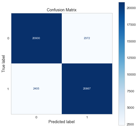
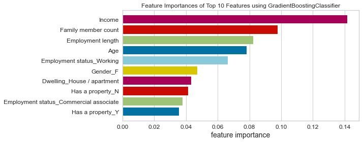
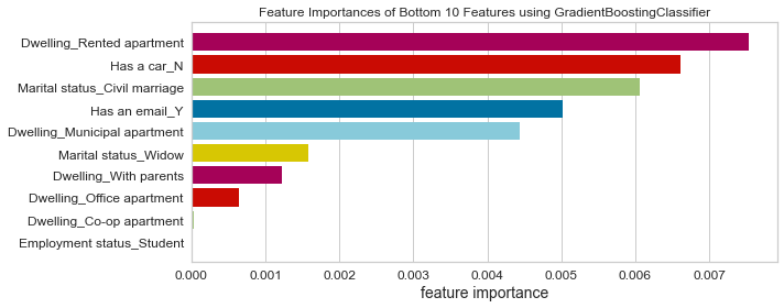
----------------------  linear_discriminant_analysis  ----------------------


              precision    recall  f1-score   support

           0       0.60      0.56      0.58     23272
           1       0.59      0.62      0.60     23272

    accuracy                           0.59     46544
   macro avg       0.59      0.59      0.59     46544
weighted avg       0.59      0.59      0.59     46544
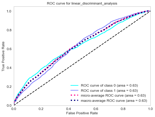
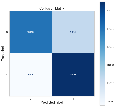
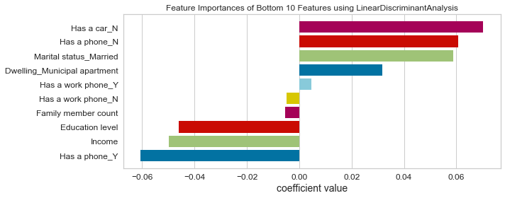
----------------------  bagging  ----------------------


              precision    recall  f1-score   support

           0       0.99      0.99      0.99     23272
           1       0.99      0.99      0.99     23272

    accuracy                           0.99     46544
   macro avg       0.99      0.99      0.99     46544
weighted avg       0.99      0.99      0.99     46544
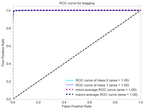

No feature importance for bagging


----------------------  neural_network  ----------------------


              precision    recall  f1-score   support

           0       0.97      0.94      0.96     23272
           1       0.94      0.97      0.96     23272

    accuracy                           0.96     46544
   macro avg       0.96      0.96      0.96     46544
weighted avg       0.96      0.96      0.96     46544
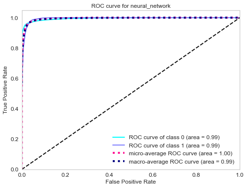
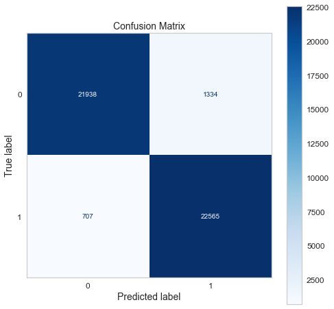
No feature importance for neural_network


----------------------  adaboost  ----------------------


              precision    recall  f1-score   support

           0       0.78      0.76      0.77     23272
           1       0.77      0.79      0.78     23272

    accuracy                           0.77     46544
   macro avg       0.77      0.77      0.77     46544
weighted avg       0.77      0.77      0.77     46544
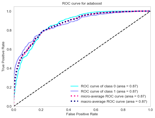
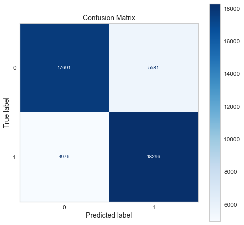
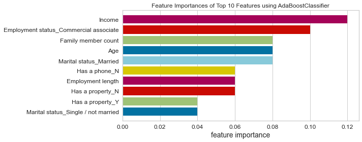
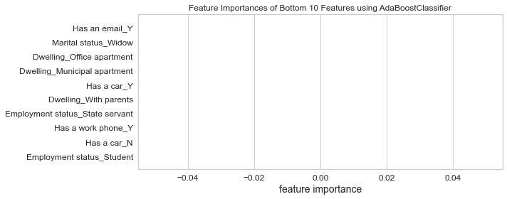
----------------------  extra_trees  ----------------------


              precision    recall  f1-score   support

           0       0.99      0.99      0.99     23272
           1       0.99      0.99      0.99     23272

    accuracy                           0.99     46544
   macro avg       0.99      0.99      0.99     46544
weighted avg       0.99      0.99      0.99     46544

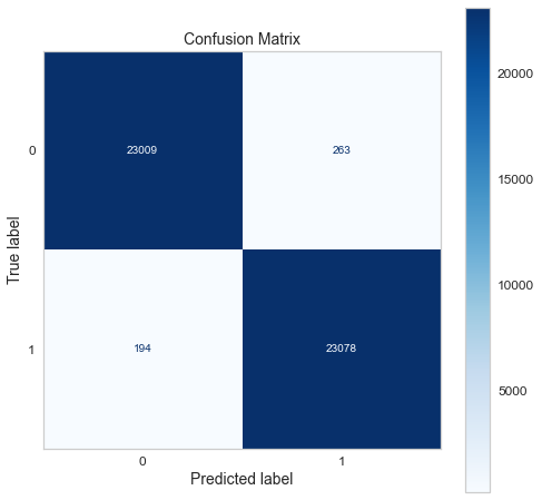
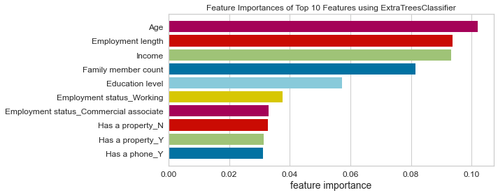
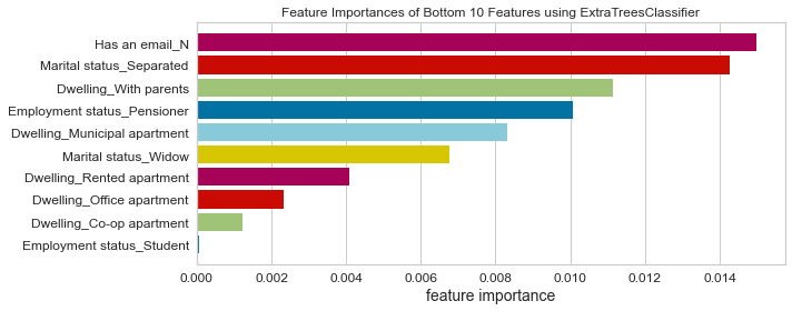
What metrics to use in order to choose the best model for this problem?
Lastly, we create a for loop function that will go through the dictionary of models and call all the functions that we have defined above.
Since the objective of this problem is to minimize the risk of a credit default, the metrics to use depends on the current economic situation:
-
During a bull market (when the economy is expanding), people feel wealthy and are employed. Money is usually cheap, and the risk of default is low because of economic stability and low unemployment. The financial institution can handle the risk of default; therefore, it is not very strict about giving credit. The financial institution can handle some bad clients as long as most credit card owners are good clients (aka those who pay back their credit in time and in total).In this case, having a good recall (sensitivity) is ideal.
-
During a bear market (when the economy is contracting), people lose their jobs and money through the stock market and other investment venues. Many people struggle to meet their financial obligations. The financial institution, therefore, tends to be more conservative in giving out credit or loans. The financial institution can’t afford to give out credit to many clients who won’t be able to pay back their credit. The financial institution would rather have a smaller number of good clients, even if it means that some good clients are denied credit. In this case, having good precision (specificity) is desirable.
Note: There is always a trade-off between precision and recall. Choosing the right metrics depends on the problem you are solving.
Conclusion: Since the time I worked on this project (beginning in 2022), we have been in the longest bull market (excluding March 2020 flash crash) ever recorded; we will use recall as our metric.
Top model
Using the ROC curve and recall, we can conclude that the best model is:
- Gradient boosting classifier
Let’s look at the picture below to understand how to interpret a ROC curve.

Source: Wikipedia
With this ROC curve, we can compare the performance of different classifiers. The closer the curve is to the top left corner of the plot without actually reaching the far end of the corner, the better the model
- Any classifier’s ROC below the dashed red line performs worst than random chance. Random chance is a 50% chance of being correct for a binary classifier.
- Any classifier with the ROC curve blended with the dashed red line is no better than tossing a fair coin.
- The orange curve is slightly better than the dashed red line, but that would not be considered a good classifier.
- The green curve is much better than the orange one but could be better.
- The blue curve is the best classifier here; this curve gets closer to the top left without touching the top left corner.
- Lastly, the “perfect” curve that touches the top left corner is not a good classifier. You might be asked why; well, a classifier with this curve is overfitting, meaning it has learned so well on the training data but can’t generalize well on the test data (unseen data).
So what to do when a classifier is overfitting? Well, these are the options to deal with this issue:
- Use a simplified model by selecting fewer parameters or constraining the model (also called regularization).
- Gather more training data.
- Discard outliers and fix missing data.
Test the final model on the test set
Now that we have our model trained, we can use it to predict the classes on the test set.
cc_test_copy.head(5)
| ID | Gender | Has a car | Has a property | Children count | Income | Employment status | Education level | Marital status | Dwelling | Age | Employment length | Has a mobile phone | Has a work phone | Has a phone | Has an email | Job title | Family member count | Account age | Is high risk | |
|---|---|---|---|---|---|---|---|---|---|---|---|---|---|---|---|---|---|---|---|---|
| 0 | 5091261 | F | N | Y | 0 | 202500.00 | State servant | Secondary / secondary special | Separated | House / apartment | -16834 | -1692 | 1 | 0 | 0 | 0 | Medicine staff | 1.00 | -6.00 | 0 |
| 1 | 5096963 | M | Y | N | 0 | 675000.00 | Commercial associate | Higher education | Married | House / apartment | -18126 | -948 | 1 | 0 | 1 | 0 | Managers | 2.00 | -16.00 | 0 |
| 2 | 5087880 | F | N | N | 0 | 234000.00 | State servant | Higher education | Civil marriage | House / apartment | -21967 | -5215 | 1 | 0 | 0 | 1 | Core staff | 2.00 | -52.00 | 0 |
| 3 | 5021949 | F | Y | Y | 0 | 445500.00 | Commercial associate | Higher education | Married | House / apartment | -12477 | -456 | 1 | 0 | 0 | 0 | Managers | 2.00 | -54.00 | 0 |
| 4 | 5105705 | F | Y | N | 0 | 225000.00 | Working | Secondary / secondary special | Married | Municipal apartment | -12155 | -667 | 1 | 0 | 0 | 0 | Laborers | 2.00 | -48.00 | 0 |
We pass to the scikit-learn pipeline the test set as we did before for the training set to obtain a preprocessed dataset ready for our model.
cc_test_prep = full_pipeline(cc_test_copy)
We extract the independent variables/features and the target variable and store them into variables X_cc_test_prep and y_cc_test_prep respectively.
# split the train data into X and y (target)
X_cc_test_prep, y_cc_test_prep = cc_test_prep.loc[:, cc_test_prep.columns != 'Is high risk'], cc_test_prep['Is high risk'].astype('int64')
Next, we train the model.
# train the model
model_trn = train_model(classifiers['gradient_boosting'],'gradient_boosting')
Then predict the dependent variable (predicted target) and store the prediction in the final_prediction variable.
final_predictions = model_trn.predict(X_cc_test_prep)
Now we use the shape method to get the number of rows and columns.
final_predictions.shape
(11654,)
We use the sum function to compare the predictions and actual target values. We store the count of the correct predictions in n_correct
n_correct = sum(final_predictions == y_cc_test_prep)
We divide the number of correct predictions by the total number of predictions to get the accuracy. We achieved 85% accuracy on the testing set, which is very good! :)
print(n_correct/len(final_predictions))
0.8579028659687661
Deploying the model on AWS S3
Now we will deploy the gradient boosting model we previously saved on our local machine to AWS S3, but what is an AWS S3 bucket, we may ask?
AWS S3 (S3 stands for Simple Storage Service) is a cloud storage service that provides access to affordable data storage in the cloud. Our trained gradient boosting model stored on S3 can be accessed with access and secret access keys.
Now, let’s store the gradient boosting model on AWS S3, but you must create an AWS account first. AWS has a free tier subscription, and hosting this model on an S3 bucket is free of charge; also, remember to create an account as a root user. After creating an account on AWS, sign in as a root user and type on the search bar s3.
You should see a dropdown menu; click on the first option with a green bucket logo.
It will take you to the Amazon s3 landing page, and click the Create bucket button.
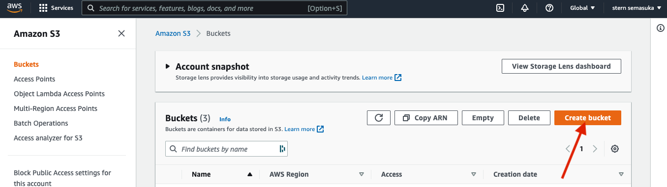
You will be prompted with this page.

Give the bucket a name; in this case, we can call our bucket name creditcardapproval; in one word, select an AWS region close to your location for better latency. We will keep the default option for the rest, then hit the create bucket button.
We see the bucket we just created in the list of buckets on the S3 landing page. Click on that bucket name, and you shall see the page below.
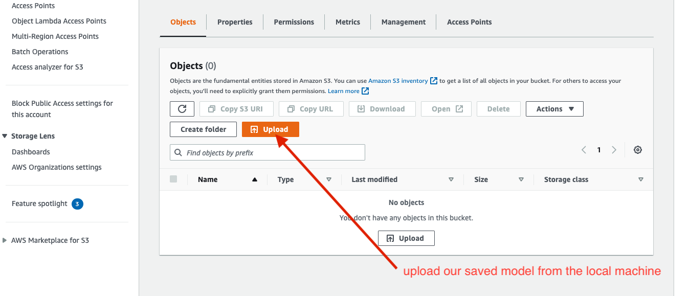
Click on the upload button, which will prompt you to another page. Click on add files, locate our saved model, hit the upload button and wait for it to upload to the bucket.
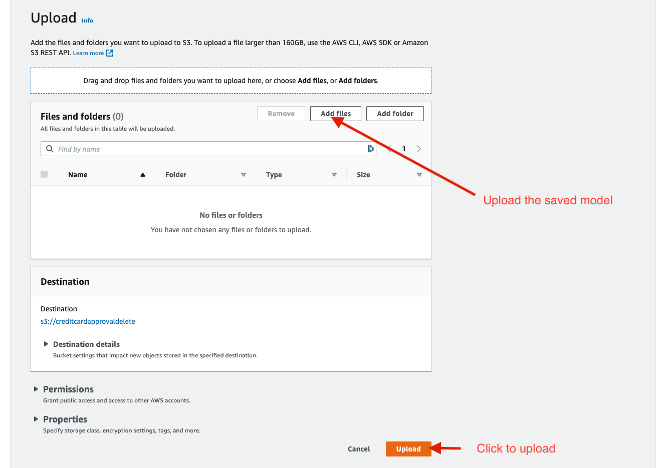
Our model is uploaded on AWS. The status should be successful if everything goes well, like the image below.
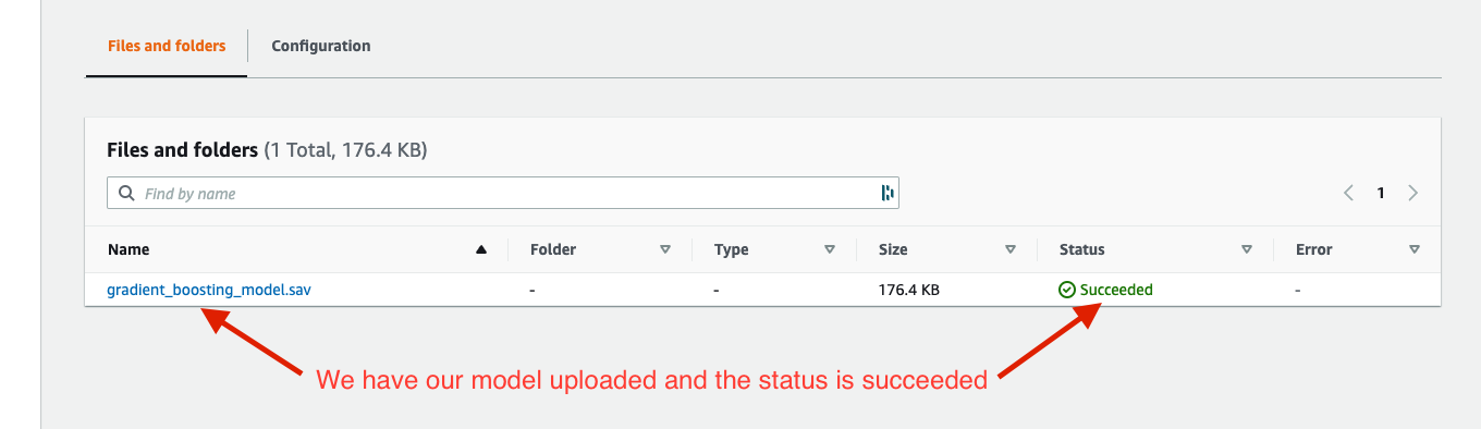
We have our model uploaded on the S3; we can now access it and make a prediction using access and secret access keys. So how do we get those two keys? We use IAM user and we need to create one.
Search for iam and click on users.

Assuming you don’t have any IAM users, you must create one by clicking on the add users.
Note: I already have mine created, so I will add a new IAM user to show you how to get the keys because we can only access the secret access key once after creating a new user. Once it is created, you can no longer access the secret access key. So keep it private and store it in a safe place.
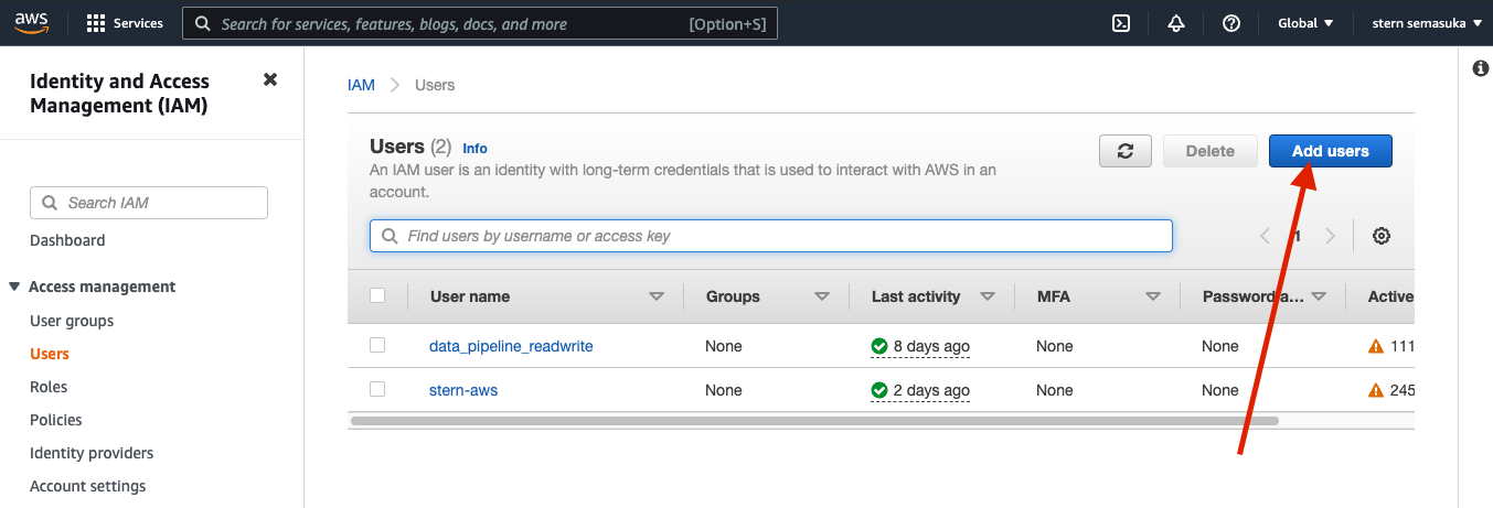
Give it a name, let’s say stern-test or whatever you want. Check the access key checkbox so we can access our s3 blob storage API; now let’s go to the next step, which is the permissions.
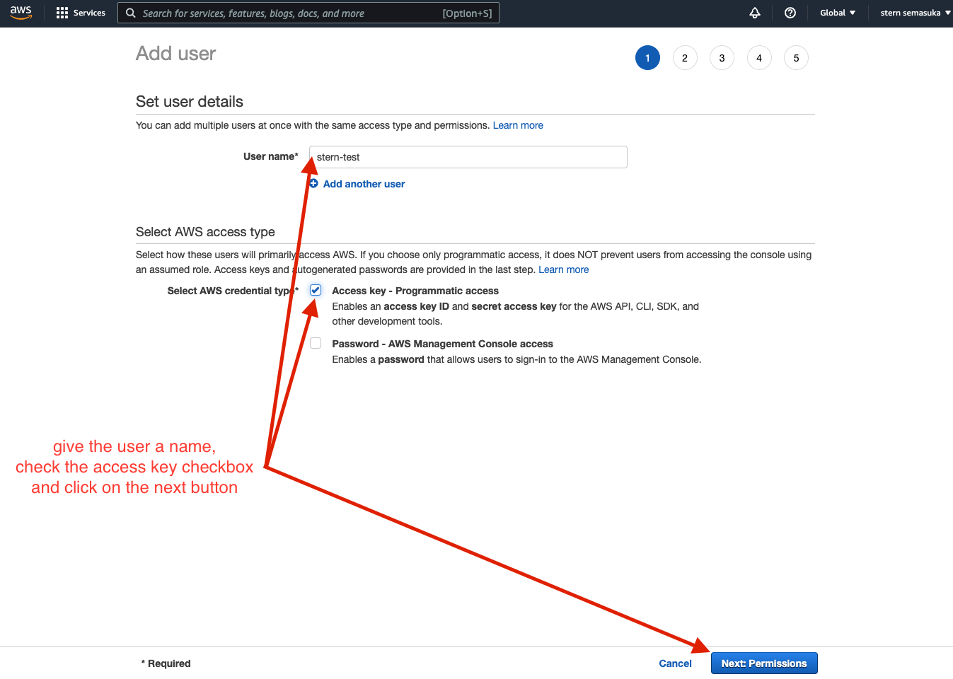
We will attach existing policies directly for the permission page. The existing permission we will be using are AmazonS3FullAccess and AWSCompromisedKeyQuarantineV2 and check the corresponding checkbox. We will set the user without the permission boundary.
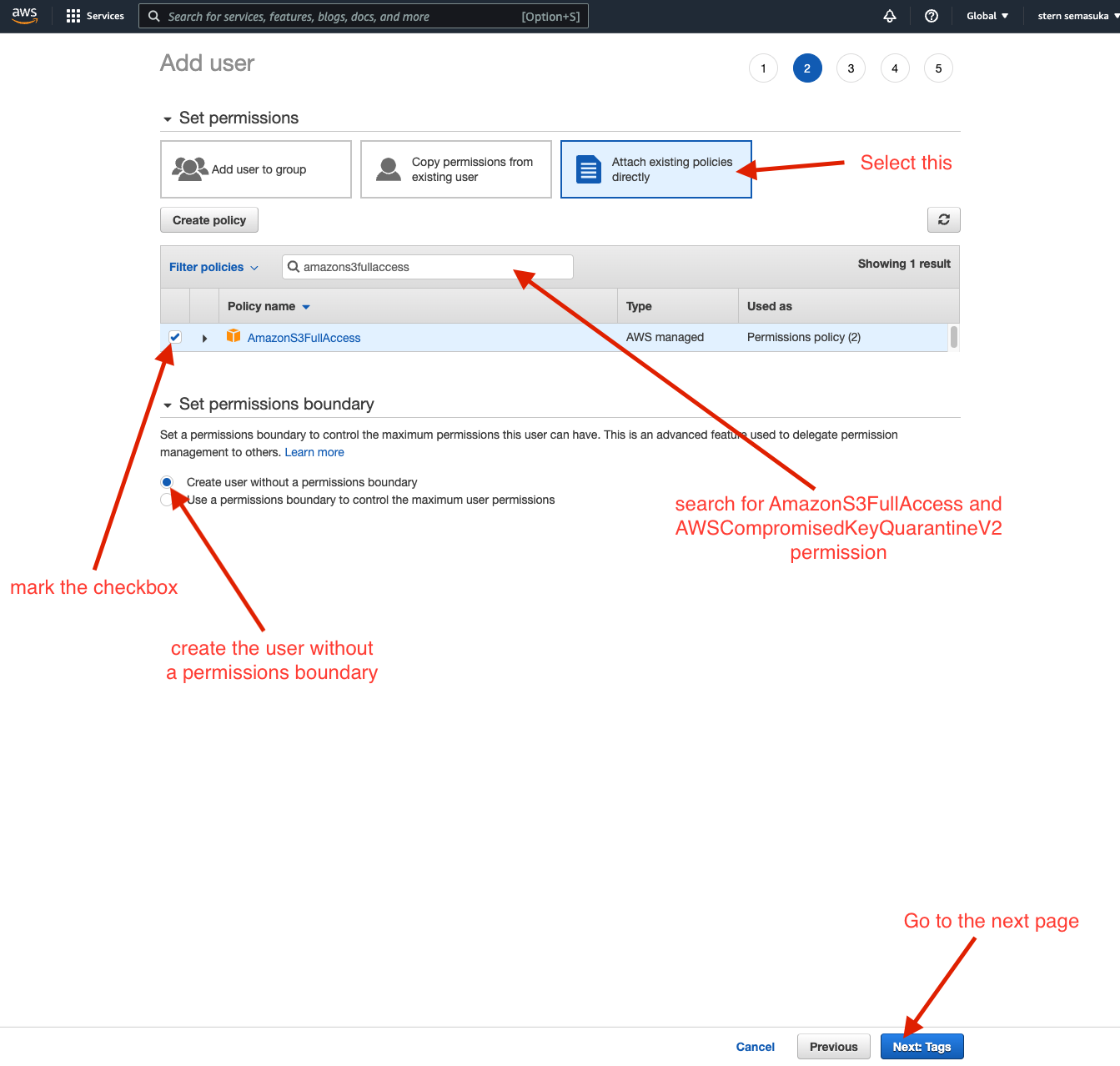
The next page is the tags page. IAM tags are key-value pairs you can add to your user. Tags can include user information, such as an email address, or can be descriptive, such as a job title. You can use the tags to organize, track, or control access for this user. Tags are optional, so it is up to you if you want to set them or not. I did not use them on my end since it is not helpful for this project. Press next for the review of the IAM user.
The review page is just a summary of the previous pages. Once you have reviewed it and satisfy with it, create the user.
Now comes the most crucial page; once the user is created, you will be prompted with the user name, the access and the secret access key. These keys will be used when linking our Streamlit web app with the hosted model on AWS. You can download the two keys as CSV files or copy them on your clipboard.
Note: This is the only time AWS will give you access to the secret access key for security purposes. You must create a new IAM user if you lose the secret access key. Please don’t share the keys; copy/save them in a safe place.
Now that you have saved your access and secret access key, you can close the page, and if you go back to the IAM welcome page, you can see the user you just created.
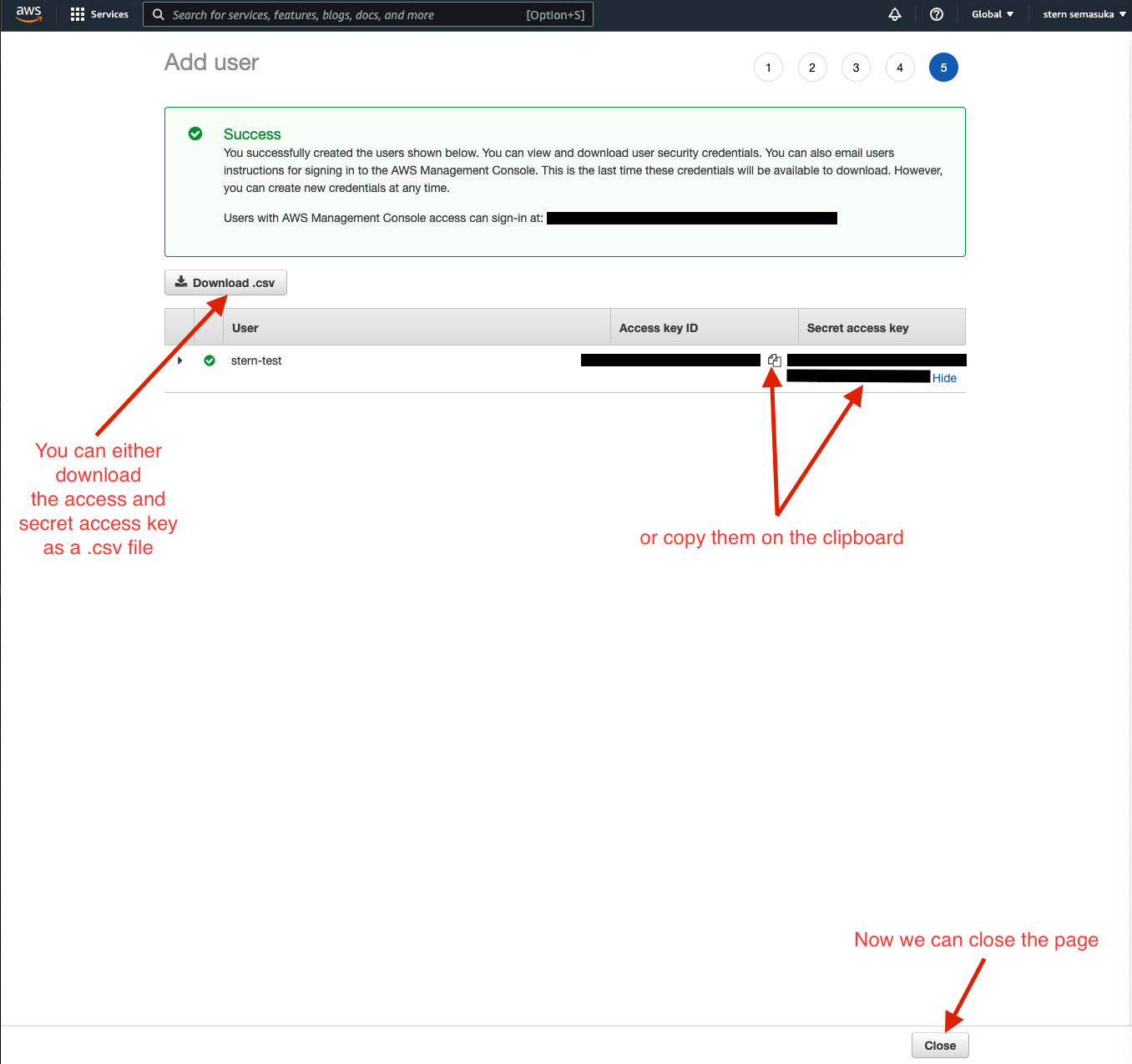
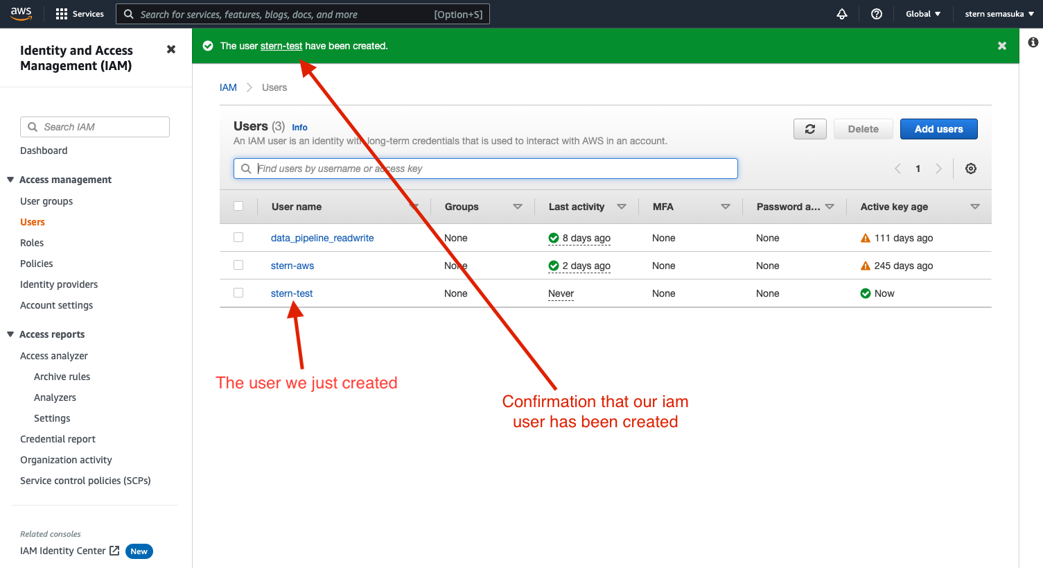
With our model stored on S3 and the two keys in our possession. We are good to go to our last two sections with Streamlit.
Streamlit Web Interface
So we have our trained model stored on AWS S3. We need an interface for the model where someone can input their information in a sort of form (which is the profile to predict) and see if they will be approved for a credit card or not.
While working on this project, I encountered an issue with how to prepare the applicant data (feature selection, engineering and data preprocessing). I encountered errors that I could not figure out how to solve. It got exacerbated due to the fact Streamlit does not support jupyter notebooks (.ipynb), only support python files (.py)
To overcome this issue, I appended the applicant’s profile to the training data and did all the data preprocessing with the training data in one python script (with the Streamlit interface code), then extracted the last row, which corresponds to our applicant.
Note: I appended the applicant profile to the training dataset but did not retrain the model (which may result in overfitting the model). I only did the data preprocessing, as we will see shortly.
The following code is part of a python script (saved as .py) used for the Streamlit web interface deployment. We will go through what each session does but won’t explain the data preprocessing part in detail because most of the functions are the same as those from the sections above.
# libraries we have already seen
import numpy as np
import pandas as pd
from sklearn.model_selection import train_test_split
from sklearn.base import BaseEstimator, TransformerMixin
from sklearn.pipeline import Pipeline
from sklearn.compose import ColumnTransformer
from sklearn.preprocessing import OneHotEncoder, MinMaxScaler, OrdinalEncoder
from sklearn.ensemble import GradientBoostingClassifier
from imblearn.over_sampling import SMOTE
import joblib
# new libraries we have not seen
import streamlit as st
import boto3
import tempfile
import json
import requests
from streamlit_lottie import st_lottie_spinner
We have already seen the first libraries in the script above; they are all the same. The second parts are libraries we have not seen yet.
- Streamlit is a fantastic library that creates an interface for our model, and very easy to deploy using the streamlit share free service
- Boto3 is the Amazon Web Services (AWS) Software Development Kit (SDK) for Python, allowing Python developers to write software that uses services like Amazon S3 and Amazon EC2. In this project, we will use it to connect our interface to the trained model on AWS S3 through the access and secret access key.
- tempfile is a module that creates temporary files and directories. In this project, it is used to store our trained model temporally in this python script
- json is used here for the streamlit hand animation while the model is predicting (This library is optional since it is for the animation and does not affect any way our predictions)
- request is used to get the animation from the server using HTTP request (This library is optional too)
- streamlit_lottie is the animation library for streamlit (This library is optional as well)
We will quickly skim through the next section; if you forgot what each function does, feel free to refer to the sessions above.
So we will import the training and testing data directly as a raw file from Github.
Note: This data already has the target feature.
So now, we concatenate the training and testing on the row axis, do a resampling(reshuffling), and split the data (80% for the training data and 20% for the testing data). We make a copy of them and store them in train_copy and test_copyvariables.
train_original = pd.read_csv('https://raw.githubusercontent.com/semasuka/Credit-card-approval-prediction-classification/main/datasets/train.csv')

test_original = pd.read_csv('https://raw.githubusercontent.com/semasuka/Credit-card-approval-prediction-classification/main/datasets/test.csv')

full_data = pd.concat([train_original, test_original], axis=0)

full_data = full_data.sample(frac=1).reset_index(drop=True)


def data_split(df, test_size):
    train_df, test_df = train_test_split(df, test_size=test_size, random_state=42)
    return train_df.reset_index(drop=True), test_df.reset_index(drop=True)


train_original, test_original = data_split(full_data, 0.2)

train_copy = train_original.copy()
test_copy = test_original.copy()
After this, we reuse the same functions and classes we used for the data preprocessing.
def value_cnt_norm_cal(df, feature):
    '''Function that will return the value count and frequency of each observation within a feature'''
    # get the value counts of each feature
    ftr_value_cnt = df[feature].value_counts()
    # normalize the value counts on a scale of 100
    ftr_value_cnt_norm = df[feature].value_counts(normalize=True) * 100
    # concatenate the value counts with normalized value count column wise
    ftr_value_cnt_concat = pd.concat(
        [ftr_value_cnt, ftr_value_cnt_norm], axis=1)
    # give it a column name
    ftr_value_cnt_concat.columns = ['Count', 'Frequency (%)']
    # return the dataframe
    return ftr_value_cnt_concat


class OutlierRemover(BaseEstimator, TransformerMixin):
    def __init__(self, feat_with_outliers=['Family member count', 'Income', 'Employment length']):
        # initializing the instance of the object
        self.feat_with_outliers = feat_with_outliers

    def fit(self, df):
        return self

    def transform(self, df):
        # check if the feature in part of the dataset's features
        if (set(self.feat_with_outliers).issubset(df.columns)):
            # 25% quantile
            Q1 = df[self.feat_with_outliers].quantile(.25)
            # 75% quantile
            Q3 = df[self.feat_with_outliers].quantile(.75)
            IQR = Q3 - Q1
            # keep the data within 3 IQR only and discard the rest
            df = df[~((df[self.feat_with_outliers] < (Q1 - 3 * IQR)) |
                      (df[self.feat_with_outliers] > (Q3 + 3 * IQR))).any(axis=1)]
            return df
        else:
            print("One or more features are not in the dataframe")
            return df


class DropFeatures(BaseEstimator, TransformerMixin):
    def __init__(self, feature_to_drop=['ID', 'Has a mobile phone', 'Children count', 'Job title', 'Account age']):
        self.feature_to_drop = feature_to_drop

    def fit(self, df):
        return self

    def transform(self, df):
        if (set(self.feature_to_drop).issubset(df.columns)):
            # drop the list of features
            df.drop(self.feature_to_drop, axis=1, inplace=True)
            return df
        else:
            print("One or more features are not in the dataframe")
            return df


class TimeConversionHandler(BaseEstimator, TransformerMixin):
    def __init__(self, feat_with_days=['Employment length', 'Age']):
        self.feat_with_days = feat_with_days

    def fit(self, X, y=None):
        return self

    def transform(self, X, y=None):
        if (set(self.feat_with_days).issubset(X.columns)):
            # convert days to absolute value using NumPy
            X[['Employment length', 'Age']] = np.abs(
                X[['Employment length', 'Age']])
            return X
        else:
            print("One or more features are not in the dataframe")
            return X


class RetireeHandler(BaseEstimator, TransformerMixin):
    def __init__(self):
        pass

    def fit(self, df):
        return self

    def transform(self, df):
        if 'Employment length' in df.columns:
            # select rows with an employment length is 365243, which corresponds to retirees
            df_ret_idx = df['Employment length'][df['Employment length'] == 365243].index
            # set those rows with value 365243 to 0
            df.loc[df_ret_idx, 'Employment length'] = 0
            return df
        else:
            print("Employment length is not in the dataframe")
            return df


class SkewnessHandler(BaseEstimator, TransformerMixin):
    def __init__(self, feat_with_skewness=['Income', 'Age']):
        self.feat_with_skewness = feat_with_skewness

    def fit(self, df):
        return self

    def transform(self, df):
        if (set(self.feat_with_skewness).issubset(df.columns)):
            # Handle skewness with cubic root transformation
            df[self.feat_with_skewness] = np.cbrt(df[self.feat_with_skewness])
            return df
        else:
            print("One or more features are not in the dataframe")
            return df


class BinningNumToYN(BaseEstimator, TransformerMixin):
    def __init__(self, feat_with_num_enc=['Has a work phone', 'Has a phone', 'Has an email']):
        self.feat_with_num_enc = feat_with_num_enc

    def fit(self, df):
        return self

    def transform(self, df):
        if (set(self.feat_with_num_enc).issubset(df.columns)):
            # Change 0 to N and 1 to Y for all the features in feat_with_num_enc
            for ft in self.feat_with_num_enc:
                df[ft] = df[ft].map({1: 'Y', 0: 'N'})
            return df
        else:
            print("One or more features are not in the dataframe")
            return df


class OneHotWithFeatNames(BaseEstimator, TransformerMixin):
    def __init__(self, one_hot_enc_ft=['Gender', 'Marital status', 'Dwelling', 'Employment status', 'Has a car', 'Has a property', 'Has a work phone', 'Has a phone', 'Has an email']):
        self.one_hot_enc_ft = one_hot_enc_ft

    def fit(self, df):
        return self

    def transform(self, df):
        if (set(self.one_hot_enc_ft).issubset(df.columns)):
            # function to one-hot encode the features
            def one_hot_enc(df, one_hot_enc_ft):
                # instantiate the OneHotEncoder object
                one_hot_enc = OneHotEncoder()
                # fit the dataframe with the features we want to one-hot encode
                one_hot_enc.fit(df[one_hot_enc_ft])
                # get output feature names for transformation.
                feat_names_one_hot_enc = one_hot_enc.get_feature_names_out(
                    one_hot_enc_ft)
                # change the one hot encoding array to a dataframe with the column names
                df = pd.DataFrame(one_hot_enc.transform(df[self.one_hot_enc_ft]).toarray(
                ), columns=feat_names_one_hot_enc, index=df.index)
                return df
            # function to concatenate the one hot encoded features with the rest of the features that were not encoded

            def concat_with_rest(df, one_hot_enc_df, one_hot_enc_ft):
                # get the rest of the features that are not encoded
                rest_of_features = [
                    ft for ft in df.columns if ft not in one_hot_enc_ft]
                # concatenate the rest of the features with the one hot encoded features
                df_concat = pd.concat(
                    [one_hot_enc_df, df[rest_of_features]], axis=1)
                return df_concat
            # call the one_hot_enc function and stores the dataframe in the one_hot_enc_df variable
            one_hot_enc_df = one_hot_enc(df, self.one_hot_enc_ft)
            # returns the concatenated dataframe and stores it in the full_df_one_hot_enc variable
            full_df_one_hot_enc = concat_with_rest(
                df, one_hot_enc_df, self.one_hot_enc_ft)
            return full_df_one_hot_enc
        else:
            print("One or more features are not in the dataframe")
            return df


class OrdinalFeatNames(BaseEstimator, TransformerMixin):
    def __init__(self, ordinal_enc_ft=['Education level']):
        self.ordinal_enc_ft = ordinal_enc_ft

    def fit(self, df):
        return self

    def transform(self, df):
        if 'Education level' in df.columns:
            # instantiate the OrdinalEncoder object
            ordinal_enc = OrdinalEncoder()
            df[self.ordinal_enc_ft] = ordinal_enc.fit_transform(
                df[self.ordinal_enc_ft])
            return df
        else:
            print("Education level is not in the dataframe")
            return df


class MinMaxWithFeatNames(BaseEstimator, TransformerMixin):
    def __init__(self, min_max_scaler_ft=['Age', 'Income', 'Employment length']):
        self.min_max_scaler_ft = min_max_scaler_ft

    def fit(self, df):
        return self

    def transform(self, df):
        if (set(self.min_max_scaler_ft).issubset(df.columns)):
            # instantiate the MinMaxScaler object
            min_max_enc = MinMaxScaler()
            # fit and transform on a scale 0 to 1
            df[self.min_max_scaler_ft] = min_max_enc.fit_transform(
                df[self.min_max_scaler_ft])
            return df
        else:
            print("One or more features are not in the dataframe")
            return df


class ChangeToNumTarget(BaseEstimator, TransformerMixin):
    def __init__(self):
        pass

    def fit(self, df):
        return self

    def transform(self, df):
        # check if the target is part of the dataframe
        if 'Is high risk' in df.columns:
            # change to a numeric data type using Pandas
            df['Is high risk'] = pd.to_numeric(df['Is high risk'])
            return df
        else:
            print("Is high risk is not in the dataframe")
            return df


class Oversample(BaseEstimator, TransformerMixin):
    def __init__(self):
        pass

    def fit(self, df):
        return self

    def transform(self, df):
        if 'Is high risk' in df.columns:
            # smote function instantiation to oversample the minority class to fix the imbalance data
            oversample = SMOTE(sampling_strategy='minority')
            # fit and resample the classes and assign them to X_bal, y_bal variable
            X_bal, y_bal = oversample.fit_resample(
                df.loc[:, df.columns != 'Is high risk'], df['Is high risk'])
            # concatenate the balanced classes column-wise
            df_bal = pd.concat(
                [pd.DataFrame(X_bal), pd.DataFrame(y_bal)], axis=1)
            return df_bal
        else:
            print("Is high risk is not in the dataframe")
            return df


def full_pipeline(df):
    # Create the pipeline that will call all the classes from OutlierRemoval() to Oversample() in one go
    pipeline = Pipeline([
        ('outlier_remover', OutlierRemover()),
        ('feature_dropper', DropFeatures()),
        ('time_conversion_handler', TimeConversionHandler()),
        ('retiree_handler', RetireeHandler()),
        ('skewness_handler', SkewnessHandler()),
        ('binning_num_to_yn', BinningNumToYN()),
        ('one_hot_with_feat_names', OneHotWithFeatNames()),
        ('ordinal_feat_names', OrdinalFeatNames()),
        ('min_max_with_feat_names', MinMaxWithFeatNames()),
        ('change_to_num_target', ChangeToNumTarget()),
        ('oversample', Oversample())
    ])
    df_pipe_prep = pipeline.fit_transform(df)
    return df_pipe_prep
Now let’s work on the Streamlit interface/dashboard.
We start by creating a title and a brief description of our interface and what it does. The streamlit function st.write will accept within the parentheses markdown markup language. So that first line that starts with # is equivalent to HTML heading H1.
st.write("""
# Credit card approval prediction
This app predicts if an applicant will be approved for a credit card or not. Just fill in the following information and click on the Predict button.
""")
The first input from the applicant is gender, and use the streamlit radio button function to choose between two options. We store the output in the input_gender variable.
#Gender input
st.write("""
## Gender
""")
input_gender = st.radio('Select you gender',['Male','Female'], index=0)
For age, we will use a slider instead, with a maximum value of 70 and a minimum value of 18, with one step at a time. We are then changing the age to days by multiplying it with 365.25, as we did in the sessions above.
# Age input slider
st.write("""
## Age
""")
input_age = np.negative(st.slider(
    'Select your age', value=42, min_value=18, max_value=70, step=1) * 365.25)
We use a drop-down for marital status. Each marital status string value is mapped to an index to create a dictionary to return that string value.
# Marital status input dropdown
st.write("""
## Marital status
""")
# get the index from value_cnt_norm_cal function
marital_status_values = list(
    value_cnt_norm_cal(full_data, 'Marital status').index)
marital_status_key = ['Married', 'Single/not married', 'Civil marriage', 'Separated', 'Widowed']
# mapping of the values and keys
marital_status_dict = dict(zip(marital_status_key, marital_status_values))
# streamlit dropdown menu function, value stored in input_marital_status_key
input_marital_status_key = st.selectbox(
    'Select your marital status', marital_status_key)

# get the corresponding value
input_marital_status_val = marital_status_dict.get(input_marital_status_key)
We again get the family count using streamlit dropdown menu.
Note: since we have removed outliers from our training model, we will only have the family count up to 6, which encompass most scenario.
# Family member count
st.write("""
## Family member count
""")
fam_member_count = float(st.selectbox('Select your family member count', [1,2,3,4,5,6]))
We use a dropdown menu for dwelling type just like we did for Marital status.
# Dwelling type dropdown
st.write("""
## Dwelling type
""")
dwelling_type_values = list(value_cnt_norm_cal(full_data, 'Dwelling').index)
dwelling_type_key = ['House / apartment', 'Live with parents', 'Municipal apartment ', 'Rented apartment', 'Office apartment', 'Co-op apartment']
dwelling_type_dict = dict(zip(dwelling_type_key, dwelling_type_values))
input_dwelling_type_key = st.selectbox(
    'Select the type of dwelling you reside in', dwelling_type_key)
input_dwelling_type_val = dwelling_type_dict.get(input_dwelling_type_key)
For income, we will input income value in a text field.
# Income
st.write("""
## Income
""")
input_income = np.int(st.text_input('Enter your income (in USD)',0))
We will proceed the same way for employment status as marital status.
# Employment status dropdown
st.write("""
## Employment status
""")
employment_status_values = list(
    value_cnt_norm_cal(full_data, 'Employment status').index)
employment_status_key = [
    'Working', 'Commercial associate', 'Pensioner', 'State servant', 'Student']
employment_status_dict = dict(
    zip(employment_status_key, employment_status_values))
input_employment_status_key = st.selectbox(
    'Select your employment status', employment_status_key)
input_employment_status_val = employment_status_dict.get(
    input_employment_status_key)
We use a slider for the employment length.
# Employment length input slider
st.write("""
## Employment length
""")
input_employment_length = np.negative(st.slider(
    'Select your employment length', value=6, min_value=0, max_value=30, step=1) * 365.25)
Again, we use a dropdown for the education level.
# Education level dropdown
st.write("""
## Education level
""")
edu_level_values = list(value_cnt_norm_cal(full_data, 'Education level').index)
edu_level_key = ['Secondary school', 'Higher education', 'Incomplete higher', 'Lower secondary', 'Academic degree']
edu_level_dict = dict(zip(edu_level_key, edu_level_values))
input_edu_level_key = st.selectbox(
    'Select your education status', edu_level_key)
input_edu_level_val = edu_level_dict.get(input_edu_level_key)
We use the st.radio streamlit function (radio button select only one input between two choices) for car ownership feature, property ownership, work phone input, phone input, and email input.
# Car ownship input
st.write("""
## Car ownship
""")
input_car_ownship = st.radio('Do you own a car?', ['Yes', 'No'], index=0)

# Property ownship input
st.write("""
## Property ownship
""")
input_prop_ownship = st.radio('Do you own a property?', ['Yes', 'No'], index=0)


# Work phone input
st.write("""
## Work phone
""")
input_work_phone = st.radio(
    'Do you have a work phone?', ['Yes', 'No'], index=0)
work_phone_dict = {'Yes': 1, 'No': 0}
work_phone_val = work_phone_dict.get(input_work_phone)

# Phone input
st.write("""
## Phone
""")
input_phone = st.radio('Do you have a phone?', ['Yes', 'No'], index=0)
work_dict = {'Yes': 1, 'No': 0}
phone_val = work_dict.get(input_phone)

# Email input
st.write("""
## Email
""")
input_email = st.radio('Do you have an email?', ['Yes', 'No'], index=0)
email_dict = {'Yes': 1, 'No': 0}
email_val = email_dict.get(input_email)
The final element on the interface is the predict button.
# Predict button
predict_bt = st.button('Predict')
So now that we have the interface ready and all the input variables, we can store those input variables in a list which will be the profile we are predicting.
# list of all the input variables
profile_to_predict = [0,  # ID (which will be dropped in the pipeline)
                    input_gender[:1],  # get the first element in gender
                    input_car_ownship[:1],  # get the first element in car ownership
                    input_prop_ownship[:1],  # get the first element in property ownership
                    0, # Children count (which will be dropped in the pipeline)
                    input_income,  # Income
                    input_employment_status_val,  # Employment status
                    input_edu_level_val,  # Education level
                    input_marital_status_val,  # Marital status
                    input_dwelling_type_val,  # Dwelling type
                    input_age,  # Age
                    input_employment_length,    # Employment length
                    1, # Has a mobile phone (which will be dropped in the pipeline)
                    work_phone_val,  # Work phone
                    phone_val,  # Phone
                    email_val,  # Email
                    'to_be_droped', # Job title (which will be dropped in the pipeline)
                    fam_member_count,  # Family member count
                    0.00, # Account age (which will be dropped in the pipeline)
                    0  # target set to 0 as a placeholder
                    ]
We will change the list into a one row dataframe.
profile_to_predict_df = pd.DataFrame([profile_to_predict],columns=train_copy.columns)
We will add the profile to predict as the last row in the train data.
train_copy_with_profile_to_pred = pd.concat([train_copy,profile_to_predict_df],ignore_index=True)
We will prepare the whole dataset (profile to predict with the training dataset) with the full_pipeline function we have defined above.
# whole dataset prepared
train_copy_with_profile_to_pred_prep = full_pipeline(train_copy_with_profile_to_pred)
To get our applicant profile observation, we first get the row with the ID = 0 and then drop the ID with the target (which was added as a placeholder) column.
profile_to_pred_prep = train_copy_with_profile_to_pred_prep[train_copy_with_profile_to_pred_prep['ID'] == 0].drop(columns=['ID','Is high risk'])
Now we will add an optional but cool animation of an impatient hand that will be displayed when the model makes the prediction; here is what it looks like.

Check out the animation in action here
And here is its function
#Animation function
@st.experimental_memo
def load_lottieurl(url: str):
    r = requests.get(url)
    if r.status_code != 200:
        return None
    return r.json()


lottie_loading_an = load_lottieurl(
    'https://assets3.lottiefiles.com/packages/lf20_szlepvdh.json')
Last but not least, we will finally create a function to make predictions. We first get the client from AWS S3 using the boto3.client function and store it in the client variable.
Now you might ask, how are we passing the keys to this function, yet there is nowhere we pasted our access and secret access key. It will be done when we deploy to streamlit share in the sections below.
we declare our bucket and model name stored on AWS, then load the model from AWS into a temporally file using the tempfile library, download, load and return a prediction as 0 (is not high risk) or 1 (is high risk).
def make_prediction():
    # connect to s3 bucket with the access and secret access key
    client = boto3.client(
        's3', aws_access_key_id=st.secrets["access_key"], aws_secret_access_key=st.secrets["secret_access_key"])

    bucket_name = "creditapplipred"
    key = "gradient_boosting_model.sav"

    # load the model from s3 in a temporary file
    with tempfile.TemporaryFile() as fp:
        # download our model from AWS
        client.download_fileobj(Fileobj=fp, Bucket=bucket_name, Key=key)
        # change the position of the File Handle to the beginning of the file
        fp.seek(0)
        # load the model using joblib library
        model = joblib.load(fp)

    # prediction from the model, returns 0 or 1
    return model.predict(profile_to_pred_prep)
Let’s create an if statement that will call the function above only when someone clicks on the predict button. The following code will be executed only when predict_bt is = 1, meaning when someone clicks the predict button.
The animation will run as long as the make_prediction function is running and will stop once the function has finished executing. If the result from the prediction is 0, a green banner for success will be displayed with text that the applicant has been approved for a credit card; it is 1, and a red banner will be displayed with the appropriate text.
if predict_bt:
    # will run the animation as long as the function is running, if final_pred exit, then stop displaying the loading animation
    with st_lottie_spinner(lottie_loading_an, quality='high', height='200px', width='200px'):
        final_pred = make_prediction()
    # the prediction is 0
    if final_pred[0] == 0:
        # display a green banner for success
        st.success('## You have been approved for a credit card')
        # display the streamlit ballon
        st.balloons()
    # if prediction is 1
    elif final_pred[0] == 1:
        # display a red banner for error/failure
        st.error('## Unfortunately, you have not been approved for a credit card')
That is it, guys!! We have our Streamlit interface ready to go; now we need to deploy it on Streamlit share and share it with the world. What an exciting moment! :)
Deployment to Streamlit share (free web hosting for the Streamlit Web interface)
In this last session, we will deploy our web interface to Streamlit share. In other words, we are creating a front-end interface for our model through which the applicant can interact with our trained model.
Before deployment, we first need to store our Streamlit file on Github, where Streamlit can pick up the files from the Github repository.
Head on to Github, sign up for an account if you don’t already have one and create a new repository just like this.

We get the following page, give it a name and description (optional) and set the repository to be public so that Streamlit can read the file. And hit the create repository button.
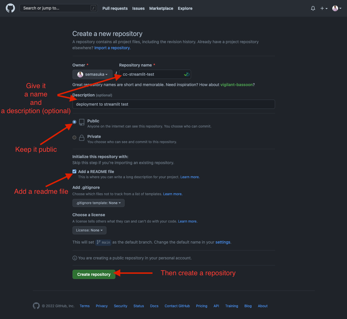
Drag and drop our streamlit python file in the area below.
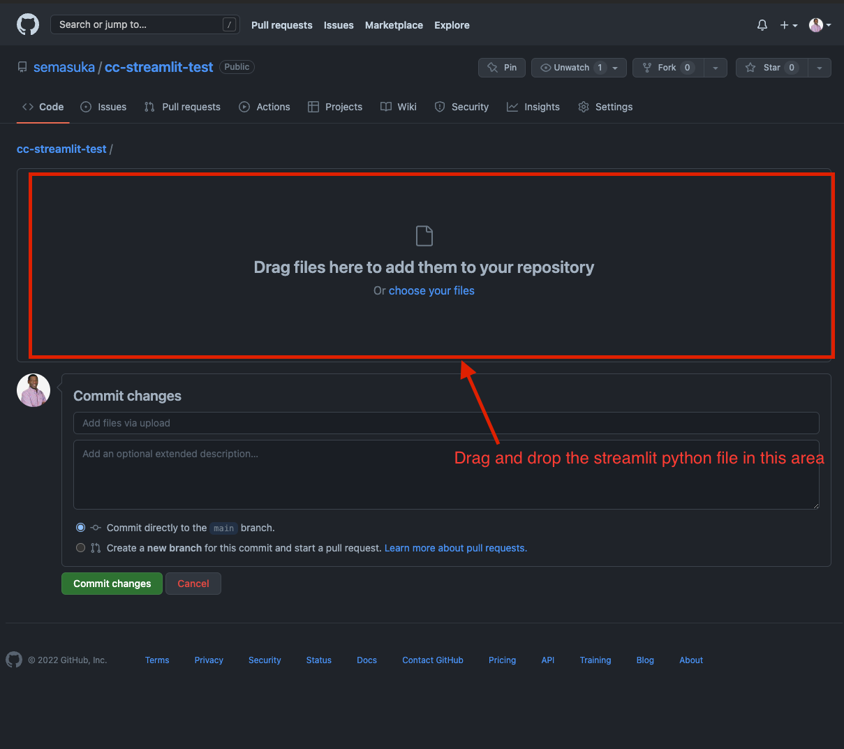
Streamlit also needs a requirements.txt file to be added to the repo. This simple text file will inform Streamlit which version of the python libraries to install on the Streamlit servers.
Create a text file locally, copy past the information below, and then upload it to GitHub like the python file.
Note: it is crucial to name the file requirements.txt so that Streamlit can read it; otherwise, it won’t deploy.
numpy==1.22.0
pandas==1.3.5
scikit-learn==1.0.2
imbalanced-learn==0.9.0
streamlit>=1.8.1
boto3==1.20.34
joblib>=0.11,<=1.0.1
streamlit-lottie==0.0.3
So now we can commit the two files after giving them a brief description.
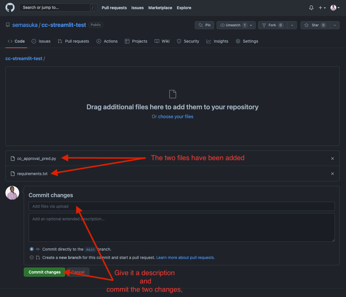
Now let’s head to Streamlit share, here is the link. You can sign up with your Google account.
After login in, you will land on this page. I already have three apps deployed here.
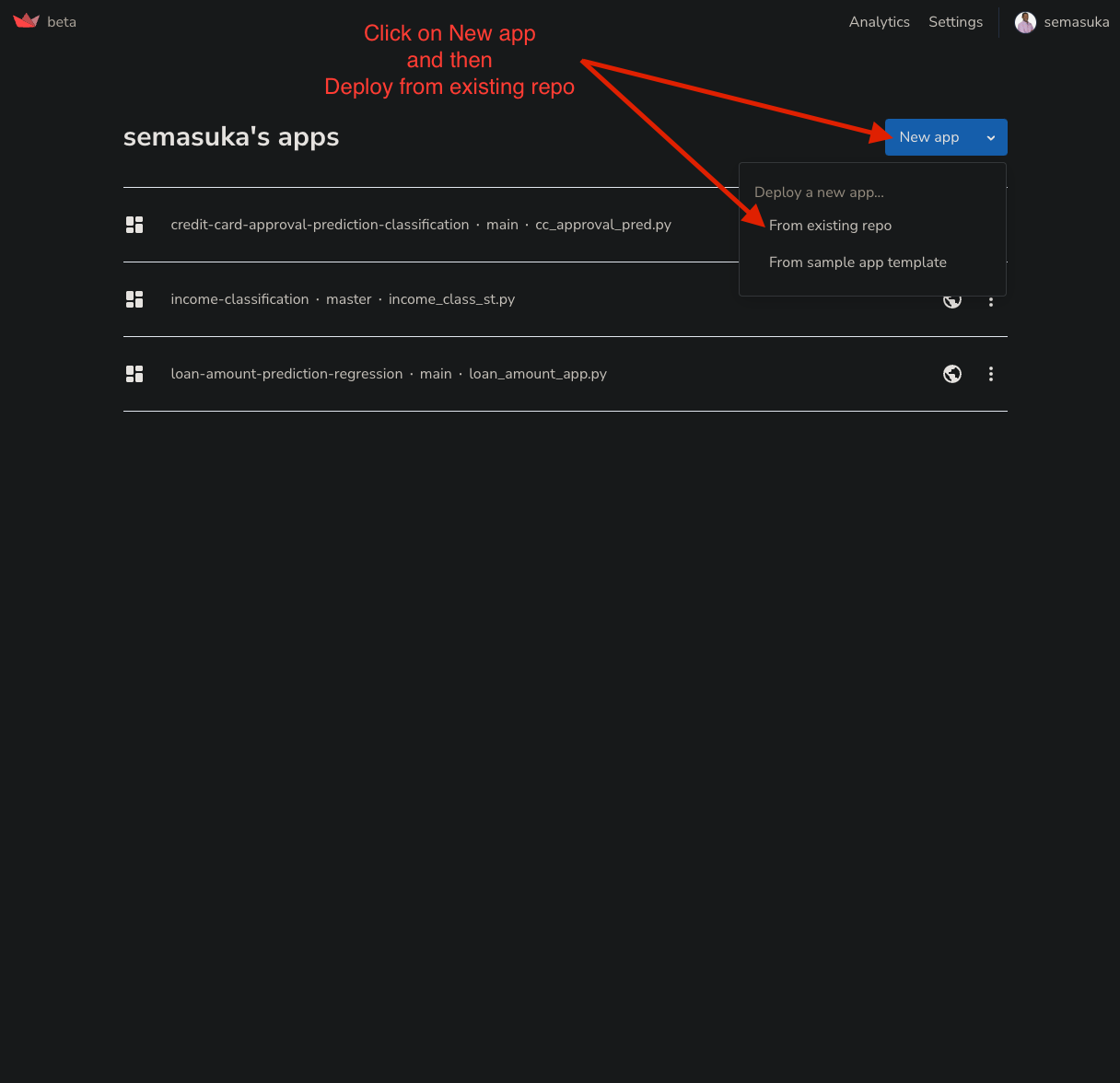
So on the deployment page, fill in the information below.
For the repository, you give it the username of your GitHub account, separated from the repository name by / For the branch, it should default, which is the main branch For main file path, it should be the Streamlit Python file name
Then click on the Advanced settings.
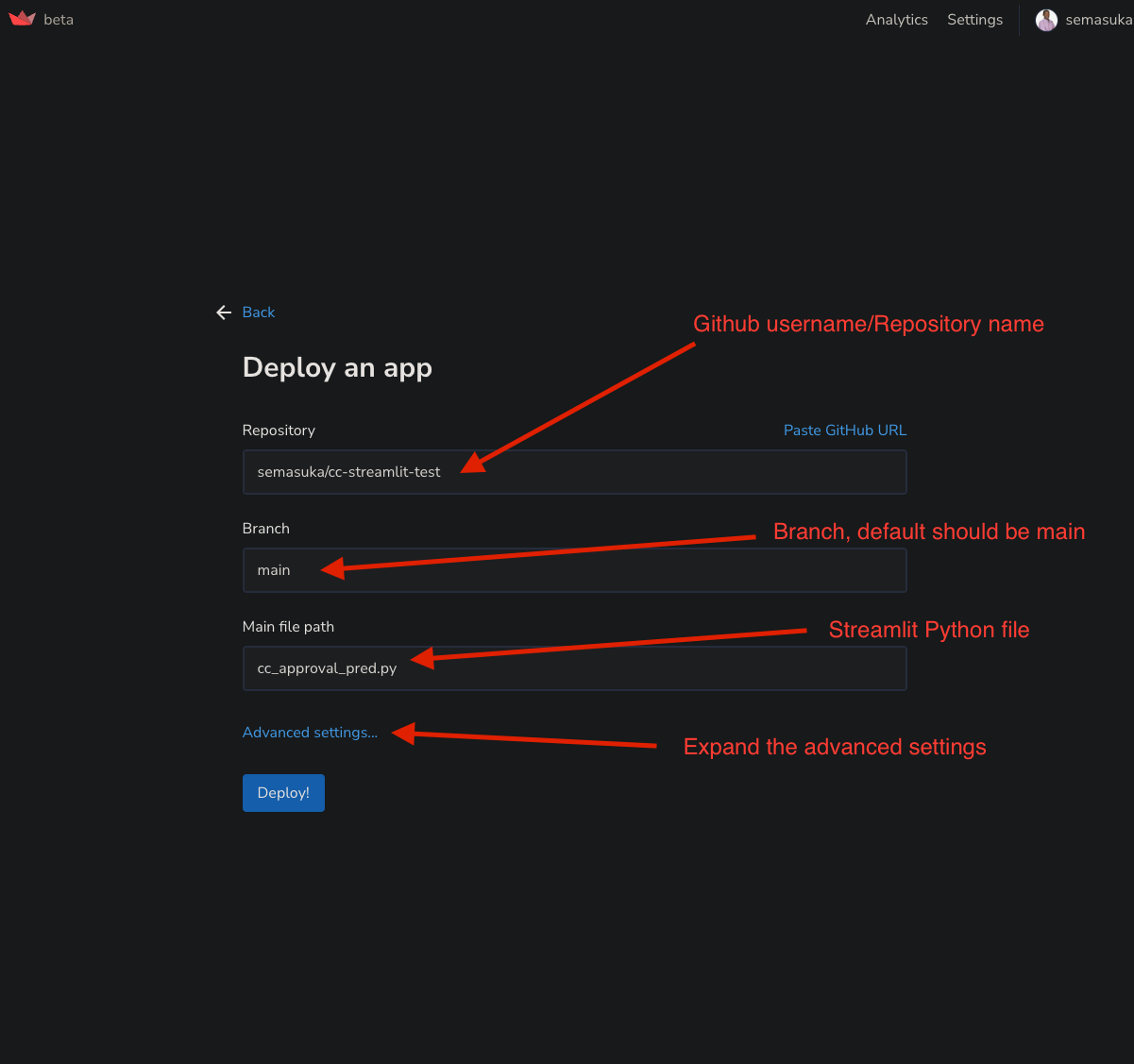
A new pop window will come; select the latest Python version and past the access and secret access key from AWS S3.
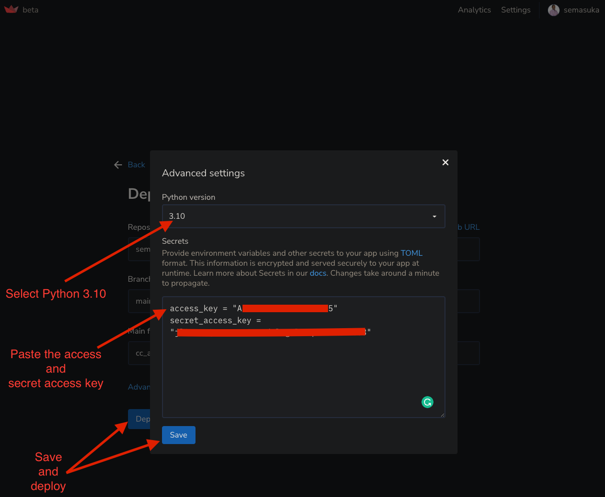
Now relax and give it a minute while the app is deploying on Streamlit.

Tadaaaa! the app should be up and running on Streamlit.
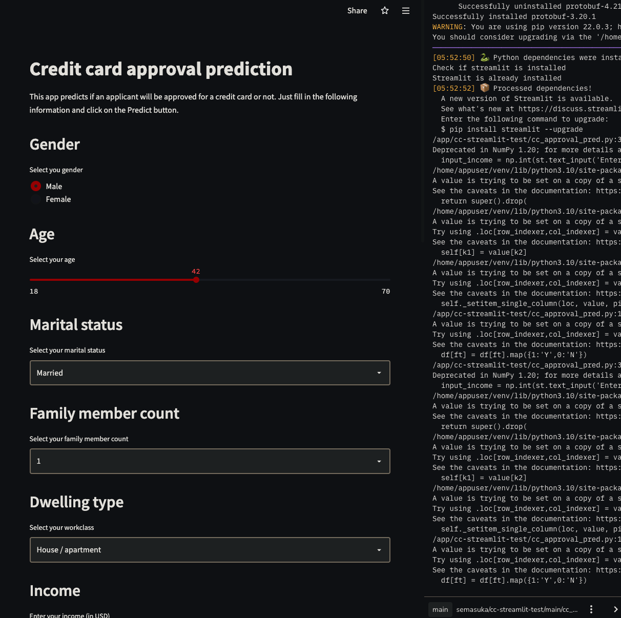
Here is the link of the app deployed on Streamlit.
Conclusion
It was a long and fascinating project. We have come a long way, and you are still with me; you deserve a pad on your shoulder. By now, you should have a good grasp of what an end-to-end Machine Learning project is all about.
In this project, we touched at pretty much the main processes into carring an end-to-end Machine learning project, which are:
- Exploratory data analysis
- Data preparation
- Training the model
- Model selection
- Testing the model
- Building a web interface for the model
- Deploying the model
The only process I would say is missing is Web Scrapping the data because, in the real world, data is not found on Kaggle or clean. Data is received either through source data (could be a file, database, or API), but sometimes we might need to scrap it from a website. Hey! this is an excellent idea for you to apply the knowledge you gained from this project to your project. Try to scrap a website for your next project and create an end-to-end machine learning project as we did in this post.
I also want to mention some of the limitations of this project and what could be improved:
- This model only predicts if an applicant is approved or not for a credit card, we could combine this model with a regression model to predict how much of a credit limit an applicant will be approved for.
- We could do a hyperparameter tuning with grid search or random search.
- We could do a chi-square test.
- We could also retrain the model without the least predictive features.
I hope you enjoyed this project as much as I did. Find the codes of this project on my GitHub profile here
Thank you again for going through this project with me. I hope you have learned one or two things. If you like this post, please subscribe to stay updated with new posts, and if you have a thought, correction or a question, I would love to hear it by commenting below. Remember, practice makes perfect! Keep on learning every day! Cheers!